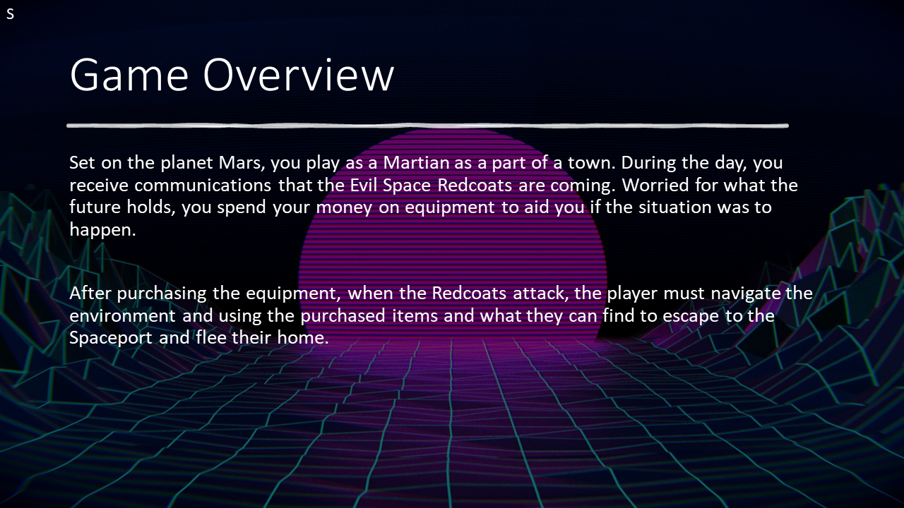
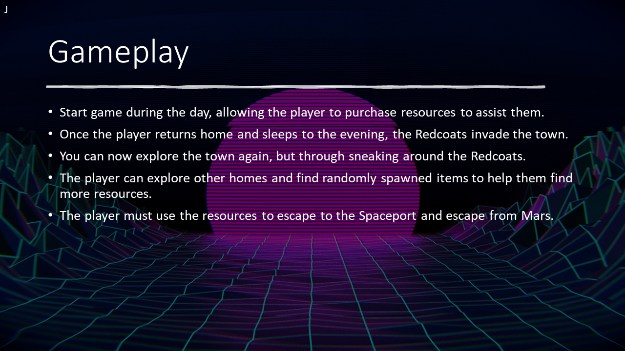
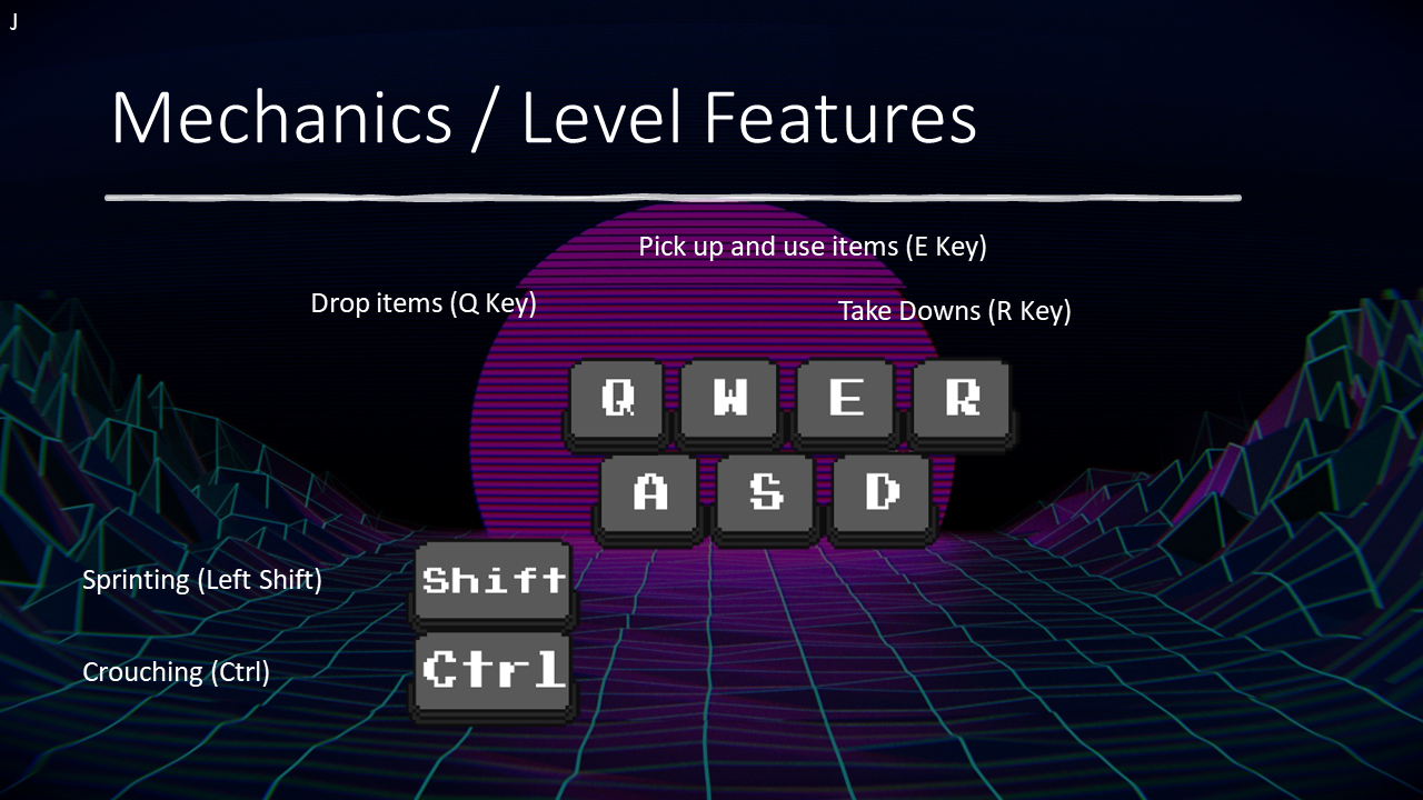
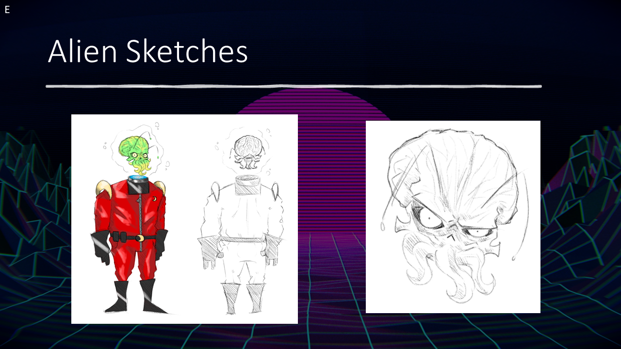
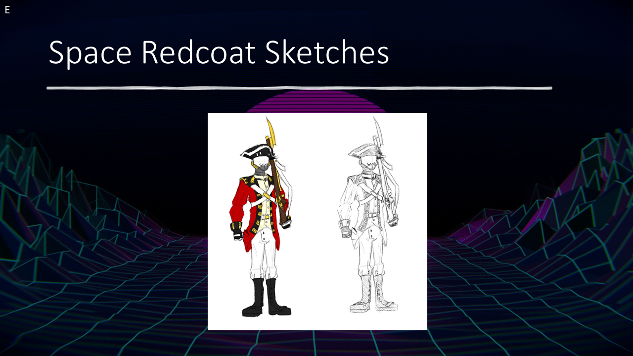
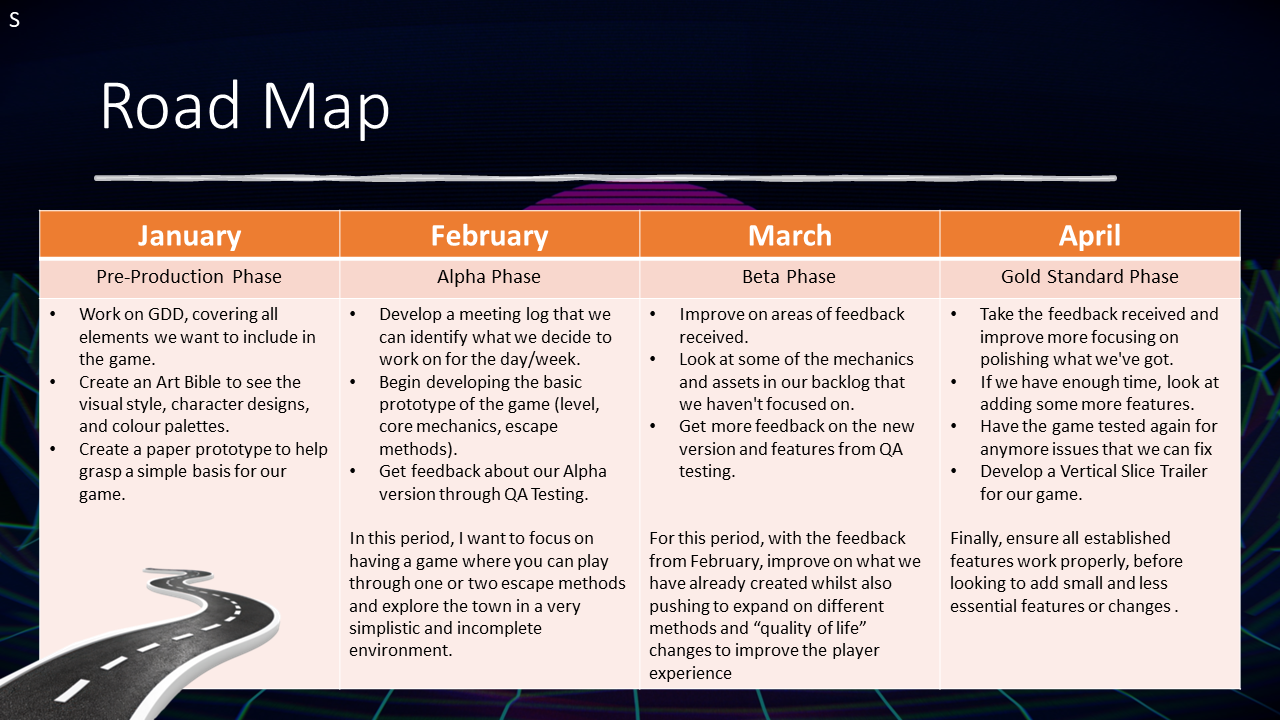
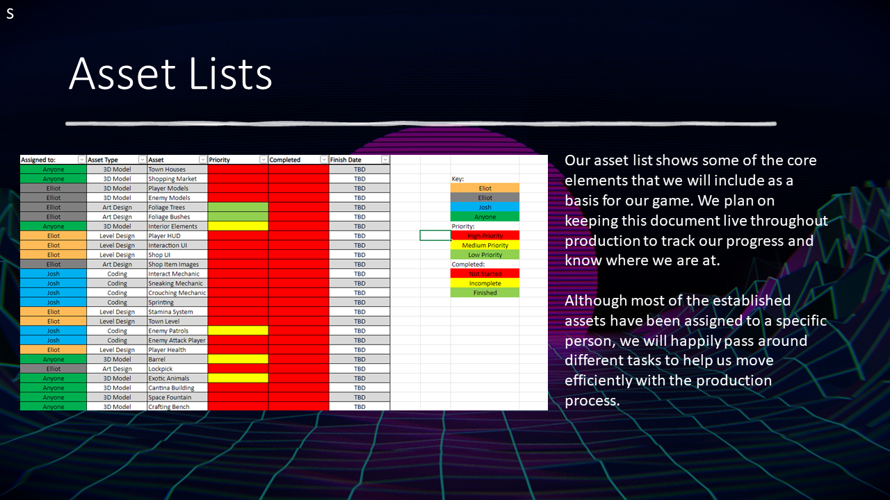
Tactics, Tea, and Tentacles is a single-player stealth game on the planet Mars. The British Empire are set to invade the planet, so the player has a day to purchase the resources they might require before trying to escape the town during the night. The player has access to several different methods to help them escape the settlement or follow there own instincts to escape.
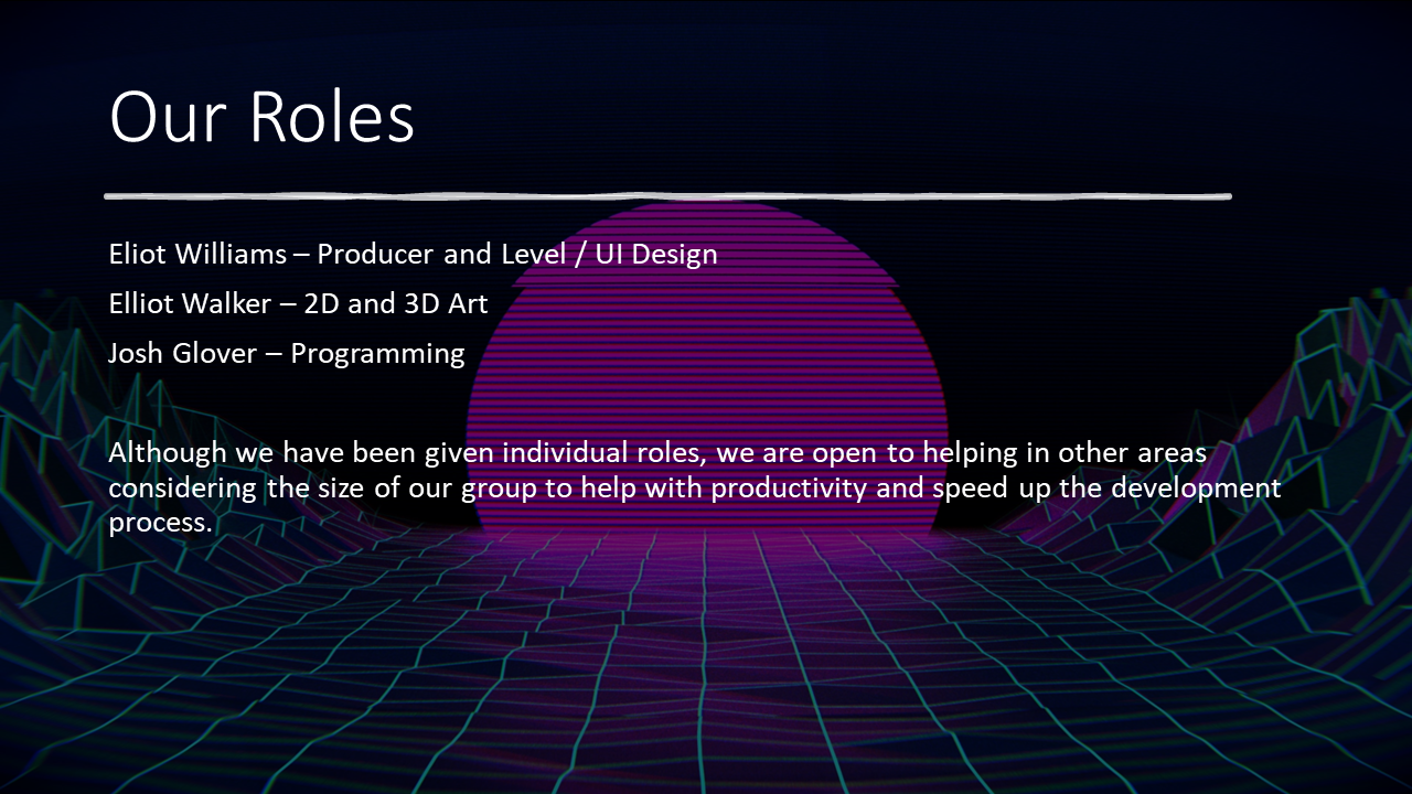
For this project, I took on the role of team lead alongside focusing on Game Design. Although that was my main area of focus, we were also a team of three, so I assisted through creating 3D Assets, Texturing, Programming, and optimisation.
2nd December 2024 - 6th June 2025
6th June 2025
Released for PC / Windows Platforms.
The Alpha Production was probably one of the longest periods of the whole project, having a very strong focus on the Programming of Mechanics and Functions, and several UI elements to really help build the game. I learned a lot of new skills in the forms of moving images in the UI, assigning images inside the UI, and how to allow the player to crouch. This was such a strong start to the project, really outlining the basics of the game in a way that we could easily build the scene and other features around what we already had, for example, we set up the UI to include the assets we would later feature in the game, helping us to really easily update the UI.
Beta Production also served as a strong period of time, unifying us in creating and designing a truly spectacular world and a fun game. Having spent nearly two months on this period, I'm super happy with everything we accomplished throughout this period. I'm significantly happy with all the new skills I've learned throughout this period and how significant testing and optimising the game can be. My favourite element of this period was seeing the visuals evolve as the days went by, going from such a linear and empty experience to such an immersive and entertaining experience. This is by far the most immersive experience, improving the atmosphere and mood substantially, to really add this alien experience to the level.
Having spent only a few weeks on this period, I'm super happy with everything we accomplished throughout this period. I'm significantly happy with all the quality of life we've developed throughout this period and how this significantly improves the Player Experience. Although Gold Standard was quite a small time frame, I feel like the feedback from Beta significantly impacted the direction we took this period in, focusing on polishing the game more, rather than adding more features into the game. This period is a strong reminder that feedback is such an essential part of a games' development cycle, and that sometimes getting some feedback and working on the player experience is a more beneficial development than adding more features.
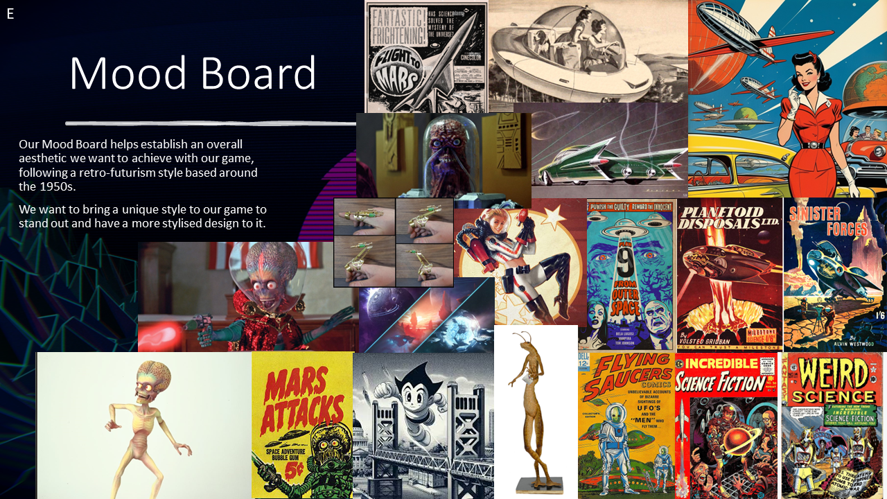
Prior to the group pitch and being put into our group, we’d spent a week developing our own idea based around the brief we had been given. As a team, we elected to look at each of our ideas, decided whether we would develop a new idea or go ahead with an established one. From here, we decided to move ahead with the idea I had developed in the Solo Pitch, but with two extra heads, we could create something visually appealing and more well-developed than I came up with on our own. We decided that a more meaningful way to express this journey would be to follow the Sci-fi genre, but instead of being two alien races, it would be a human group attempting to take control of Mars. As previously mentioned, I didn't want to lean into the realistic elements of the Refugee Journey and focus on telling a light-hearted story that masks the harsh reality of this world. We continued with working inside a PowerPoint to expand on our pitches and the ideas we would come up with, as well as this being a collaborative document where we all added our own elements to develop this idea further. We chose a retro-futurism aesthetic because we felt like it would stand out and come across as a unique style in comparison to other projects we had seen previously. Not only that, but we also took a lot of the violent decisions from my original solo pitch and really focused on the more cartoonish and moved to a more comical sense, rather than the brutality, pushing the message in a more subtle way.
On reflection of this Pitch, I think that our pitch went well and captures a unique twist on my original idea. We have a very unique art style of 1950's Retro-Futurism which we thought would help express an interesting and memorable style to our game. As a part of the feedback we received, I also agree with explaining more on the environment and expressing it through a drawing to help establish the overall look. Also more on the gameplay, camera movements and how the game would follow in a linear path, start to finish. I think I should have included a slide where we linked back to the brief and explained how and why this fits to have also cleared up with some of the confusion that we received after out pitch. Moving forward from this, the focus will be on explaining what I am working towards more clearly and how things will work in the long run.
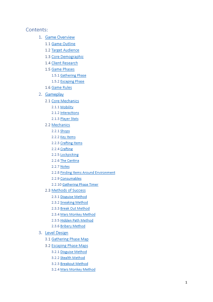
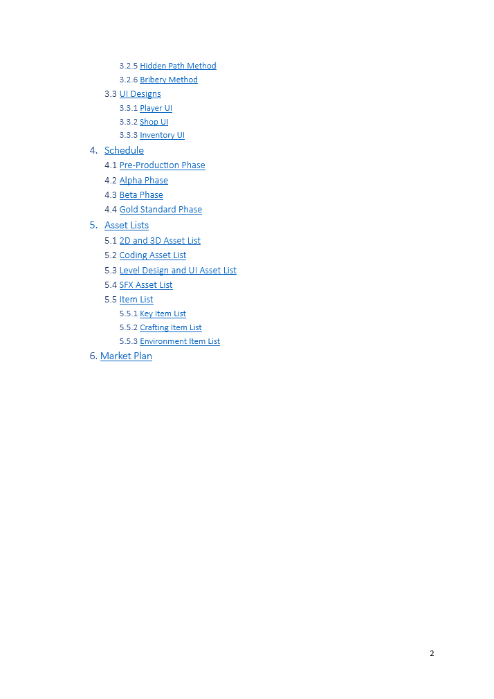
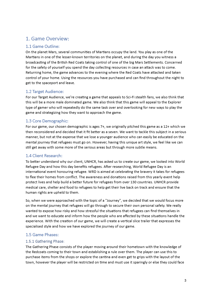
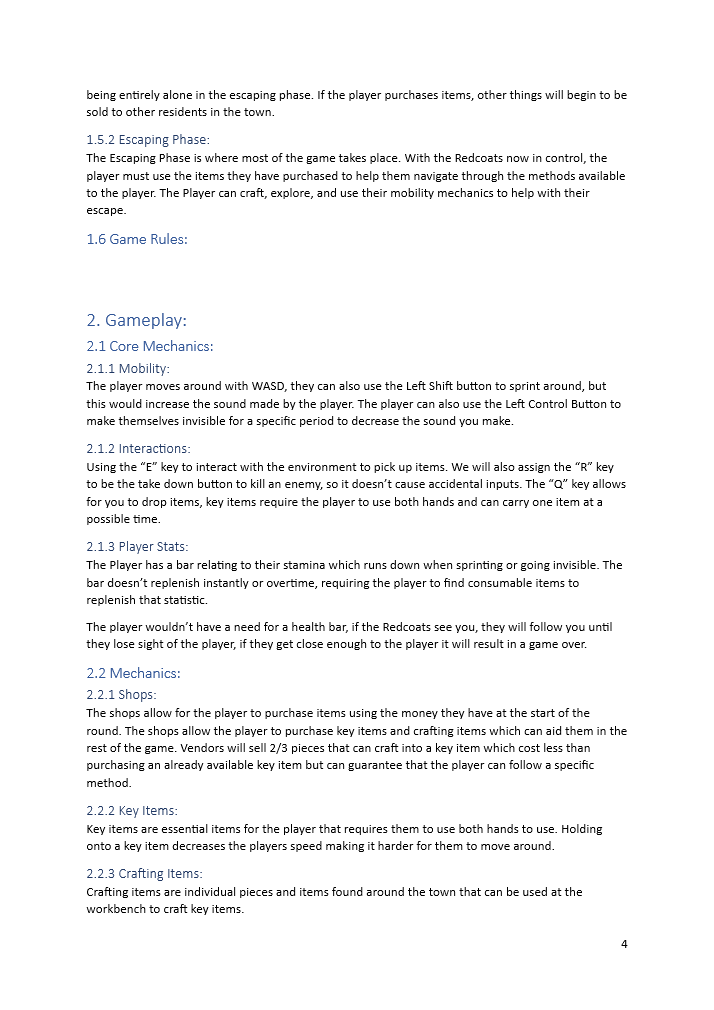
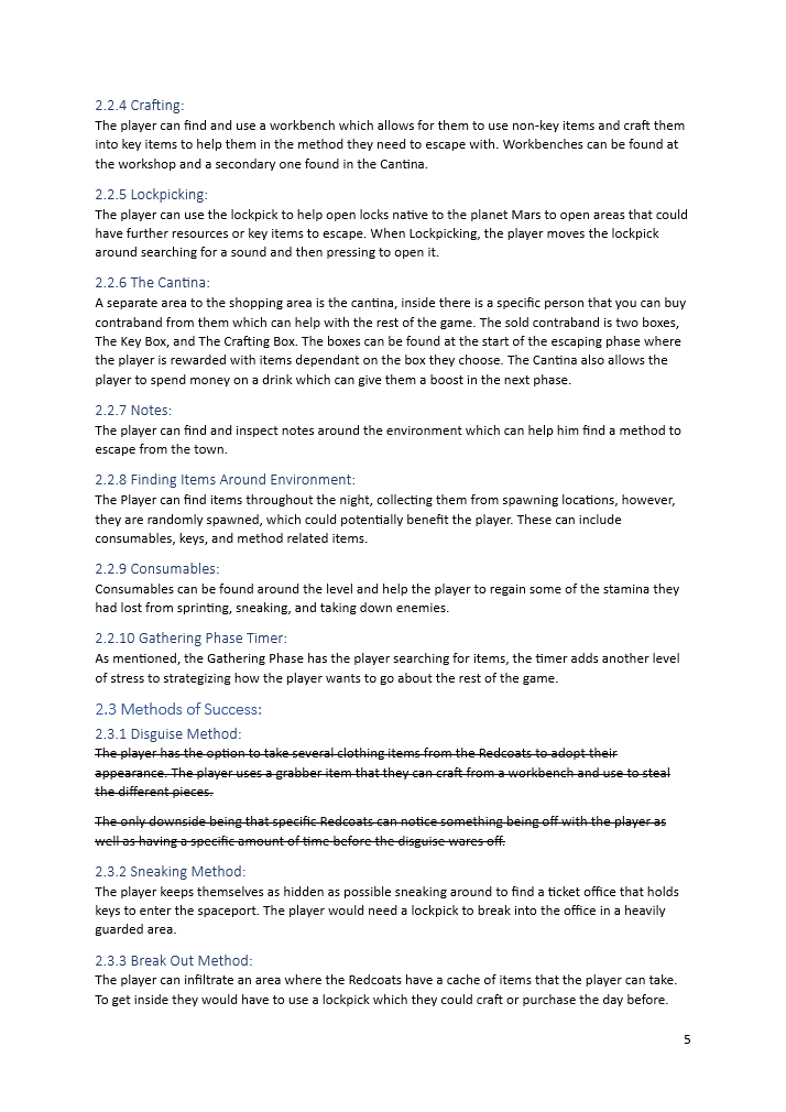
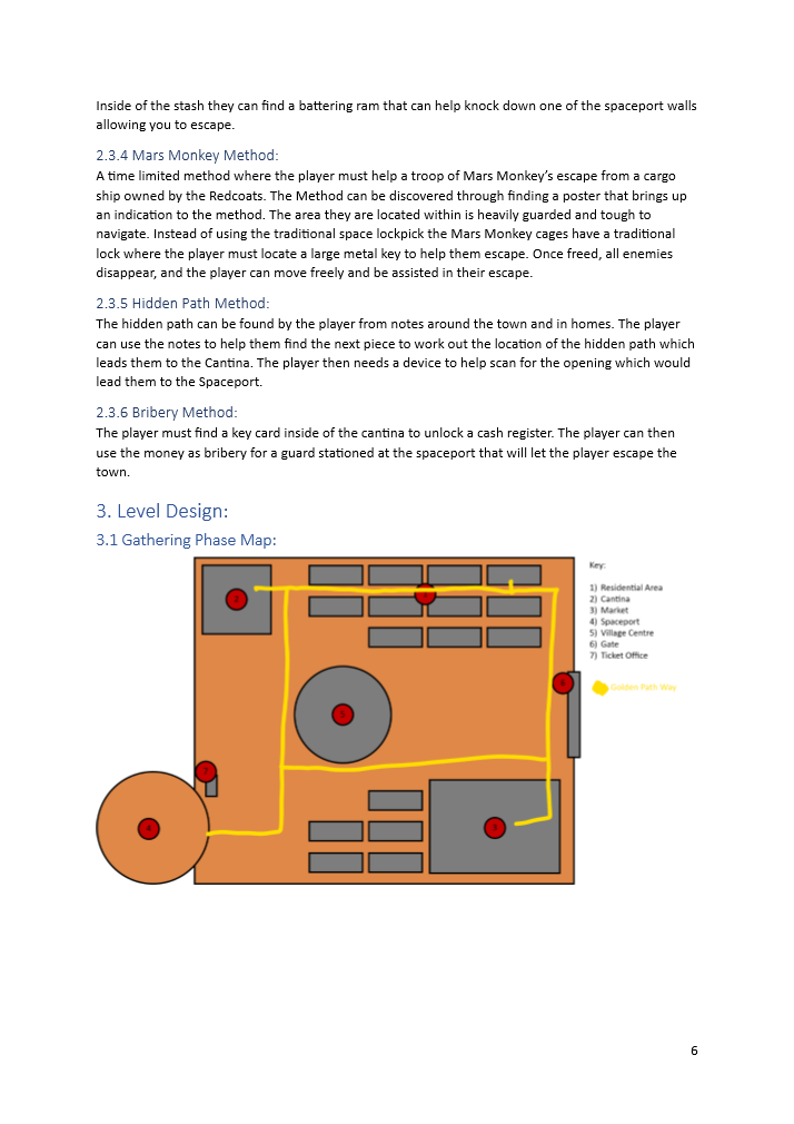
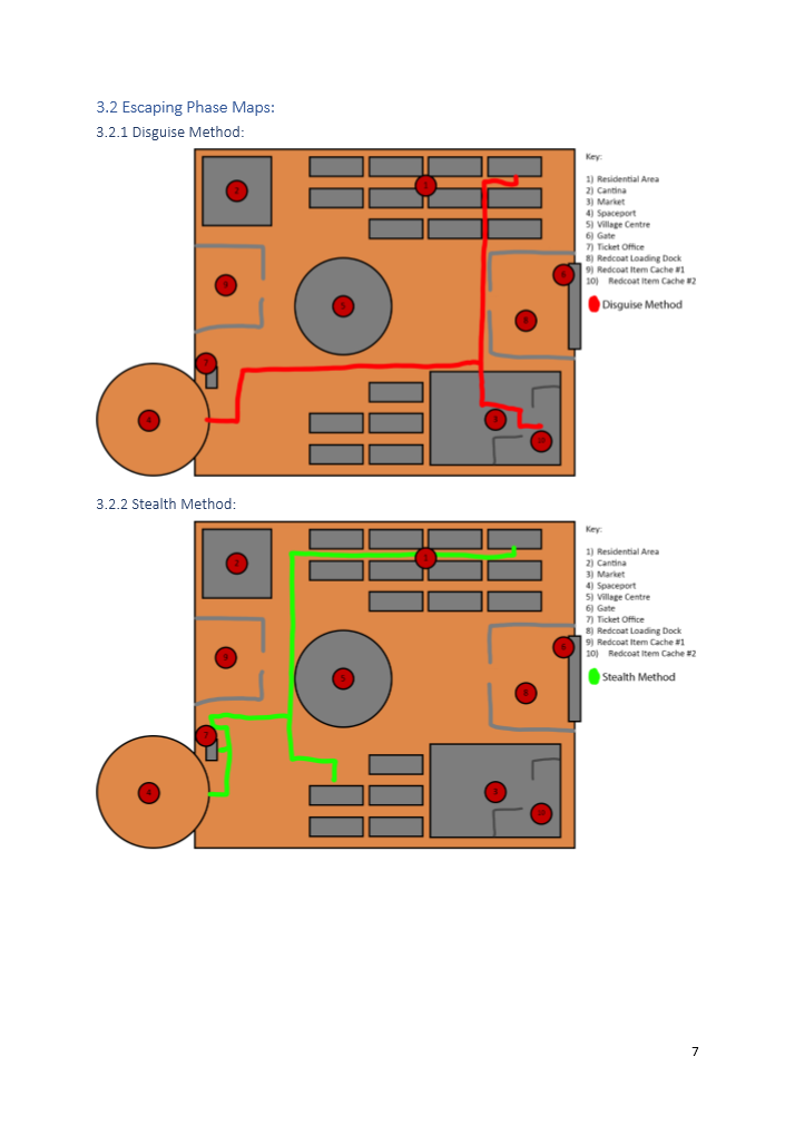
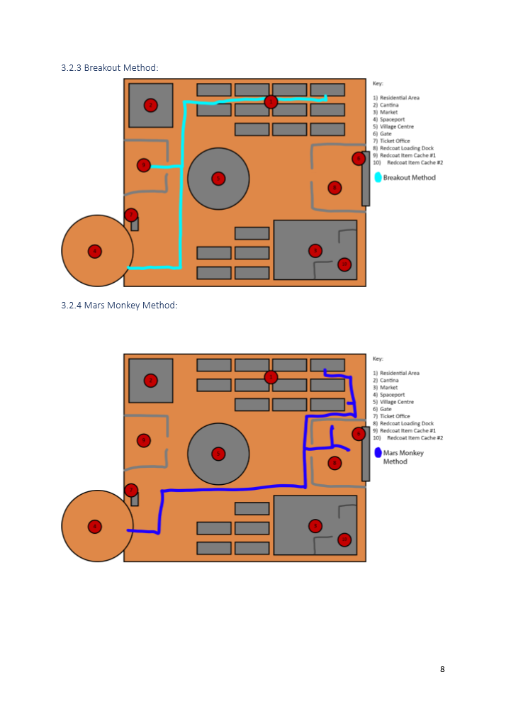
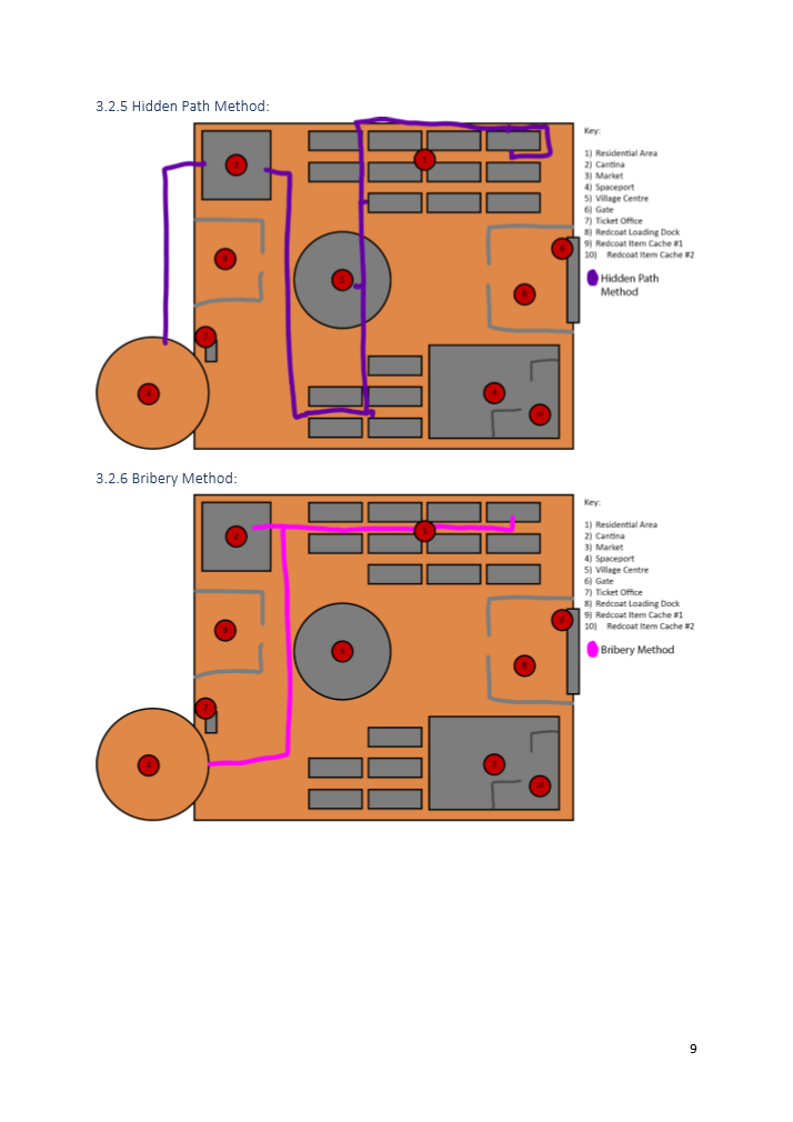
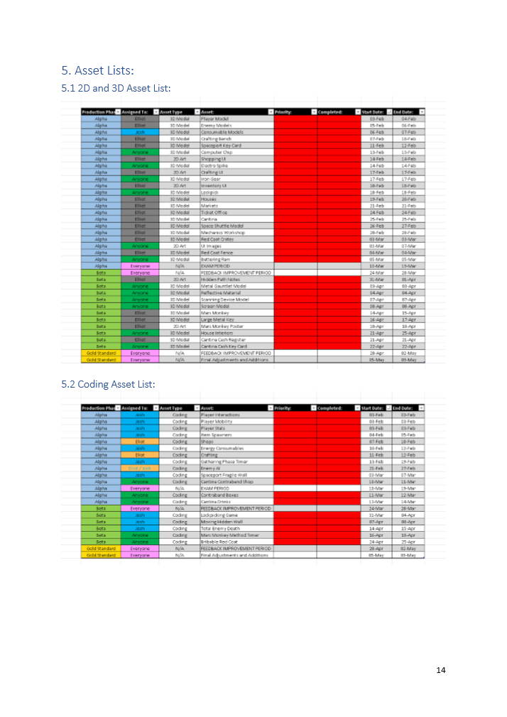
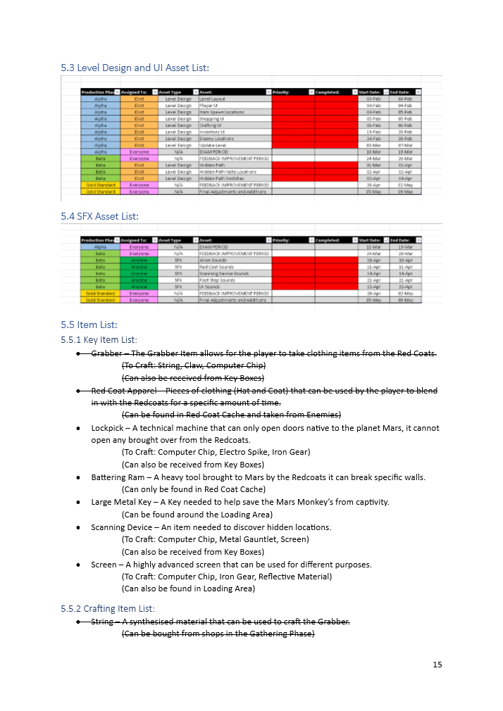
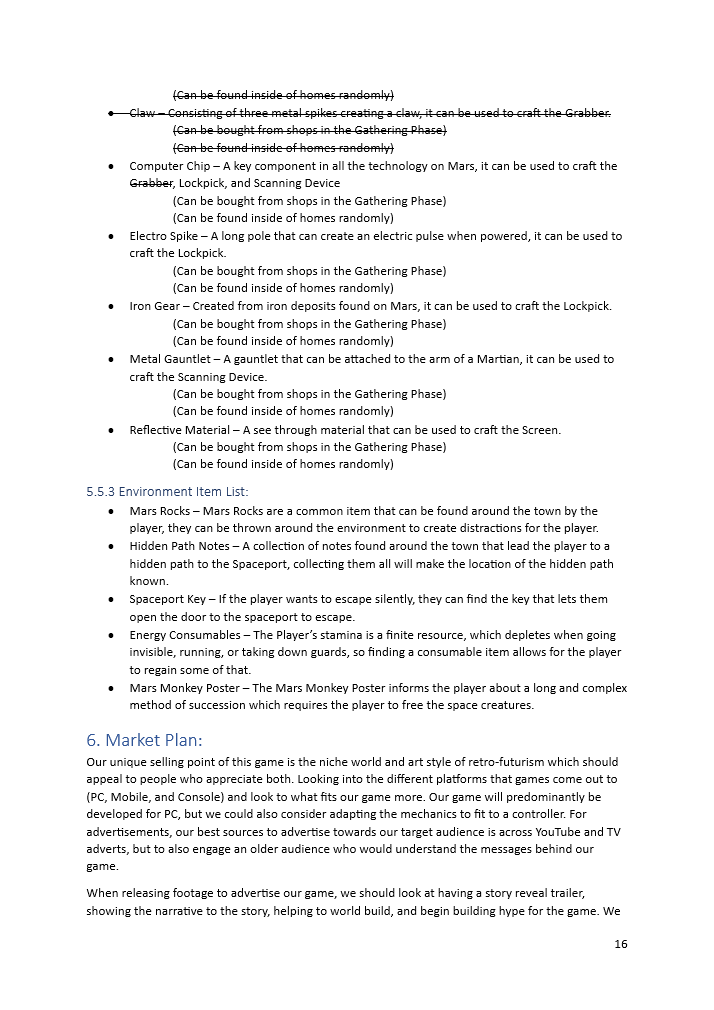
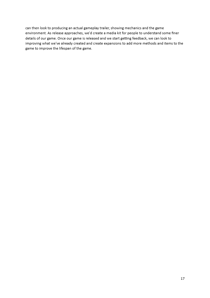
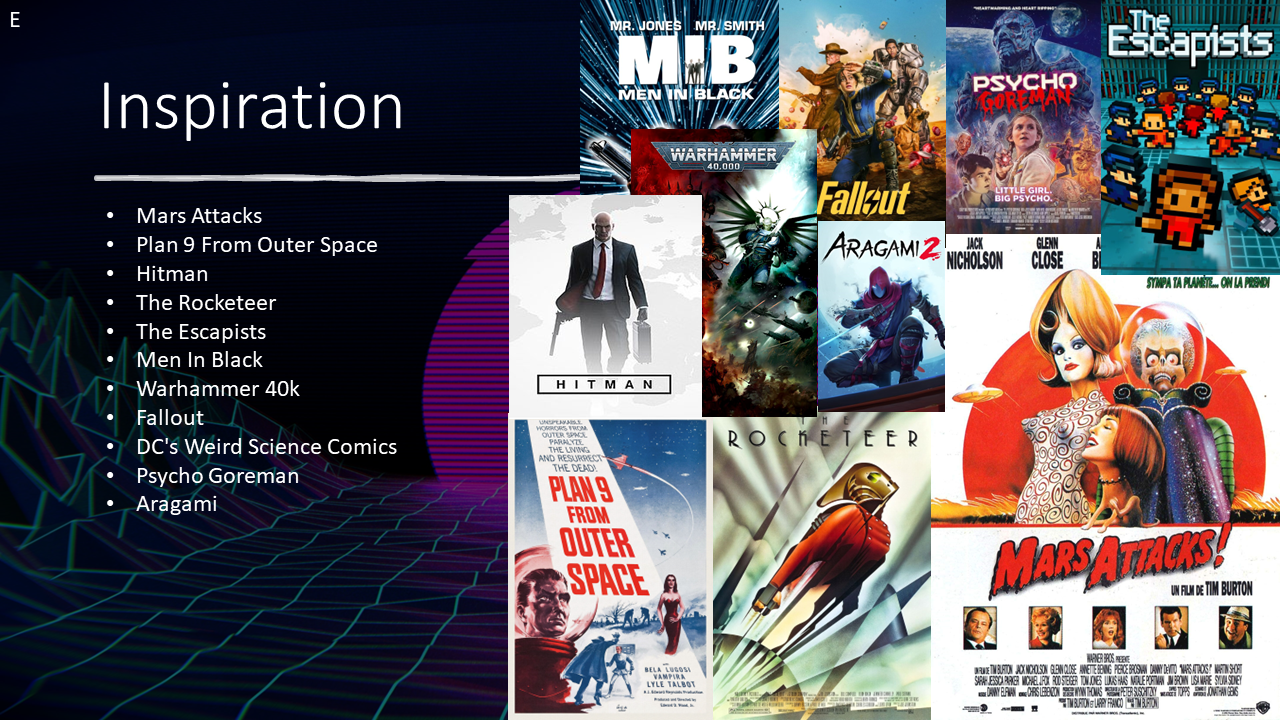
As Team Lead, I took charge of the GDD and how the format of the document should be, while keeping it a live document that we could update as production advanced. The GDD was our starting point for working on this game; we used this as a basis to work out the assets and mechanics we would need to develop these features inside our Word document. As detailed in the Game Overview, TTT is a strategy game where the player needs to use the resources they gather to follow a laid-out path to escape from the invading Redcoats. We took heavy inspiration from the Hitman games, giving the player lots of choices to complete the main objective by finding random items and following other clues to figure out how you can escape the Redcoats.
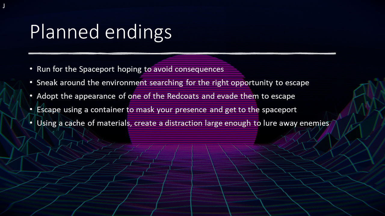
We started by figuring out 5 different methods for the player to follow, and then expanding on how we could make them more risky and stressful to navigate while playing the game; this included areas highly populated with enemies, and finite stamina to force the player into this sense of unease.
This idea of stress and planning ahead stemmed from how we saw the initial beginnings of a refugee's journey. We wanted to get across the risks and chances that a refugee must take to survive; this included using any means possible, whether considered good or bad, to achieve their own safety.
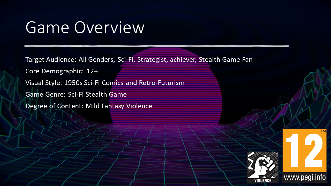
Inside our GGD, we also included our client research, which helped us understand the client further and how our idea can connect with what they stand for. World Refugee Day celebrates the bravery that refugees must have to survive the dangers they must face, and we plan to mirror that by putting the player inside stressful situations that they must navigate and overcome. With such a heavy and powerful topic, we were very particular from the beginning about what we should and shouldn't include to not insult or hurt the people who have been affected by these circumstances. From the beginning of the Group Pitches, we were very clear in focusing the style, design, and events on a more cartoon and unrealistic style, feeling that expressing the harsh realities would be too much for the target audience of PEGI 7 we wanted to educate. We want this project to have less of an explicit message and keep it more tucked away in the back for an older player to experience and understand instead.
On reflection, the GDD works really well and is a solid guide for what we want to include and how we plan for it to function. We should keep this document as a live document so we can edit and change details for later reference as the project evolves and develops. As much as we discussed the GDD as a whole, I think it would have been good to let the others on my team edit and add details as they saw fit. They did have access to the developing document, but the document wouldn't update live, which caused some issues, leading us to only have me editing it, which did take more time in the long run. The GDD was an effective document that helped clearly outline the gameplay loop and the significant mechanics that we intend to include. Similarly, this allows team members working on an area they are unfamiliar with, or even other people seeking more information on the game, to easily navigate and develop an understanding of our game.
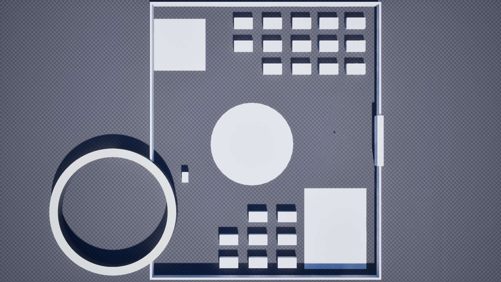
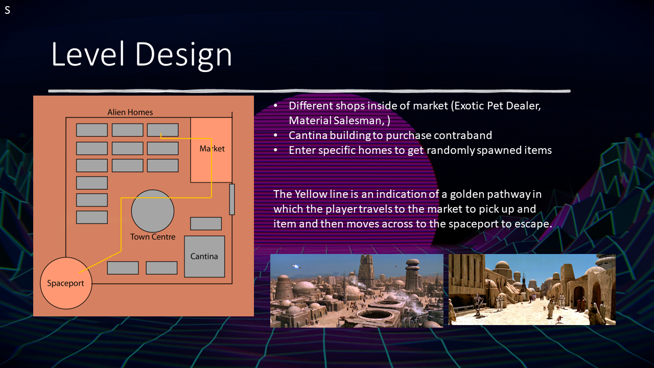
The first element I developed for the project was outlining the layout of the level and putting everything in the places we wanted them to go so we could gauge the scale of how large the level was and how much space we would be taking up. For this White Box, I used several basic cubes and scaled them into different shapes to help differentiate everything from each other. One of the other factors I took into account when developing this was the level's scale in comparison to the player. To ensure I had the scale done correctly, I included a default Mannequin helping me see the scale of the world. I also used a cylinder to create the circular base for the town centre, which we weren't totally sure about what we were putting here, but outlining where it could go definitely helped us remember the location was something we needed to develop in the future. The hardest shape to create for the level was the ring-shaped spaceport, since we aren't provided with one as a default in Unreal Engine. So to help with this, I utilised the Brush Tools to allow me to start with a basic cylinder, then create a duplicate that would subtract the interior section, and finally use both brushes to create a single static mesh to allow for us to drag and drop the complete model.
On reflection, I think for a very basic level layout, this works well; it is very flat and linear, which makes the development of the alpha production easier in making all the moving parts stand out individually rather than being hidden behind the environment. However, the very bland and flat layout of the level makes it difficult to prompt the player to move around and explore, and makes it difficult for the player to remember the location they started from. When we eventually turn from mechanics and features to focusing heavily on the design and flair to make the project stand out, leaning further into the futuristic style we want to go for, we will keep the layout in mind, pushing the player to be interested in specific locations and drawing them in.
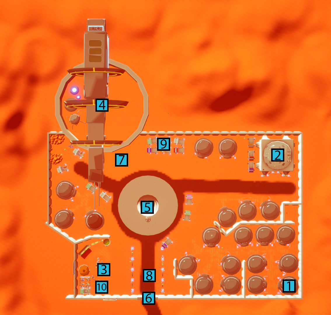
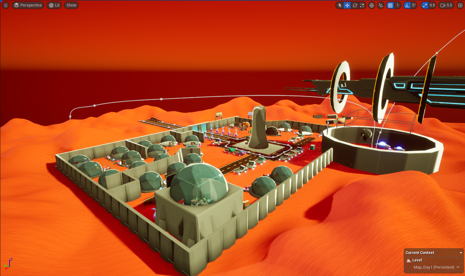
A piece of feedback I received about the design of our level was to rearrange the grid-style layout to make it more unique and force the player to explore the level further. Most notably with this, the street with the player's house (1) ends in two directions, giving the player the choice to go further into the town, or discover what's around the corner. To further push the player's attention to other places, we added a temporary text render to the Cantina (2) so that the player knew what was over there and maybe catch their interest straight away. I also swapped out the Meridian for the Goliath at the spaceport (4) since the sheer size of the ship was so large that it looms over the player, capturing the new and improved lighting and creating brilliant god rays when looked at.
To achieve these new lighting effects, I removed the original lighting components (Directional Light, Height Fog, Sky Atmosphere) and, using the Environment Light Mixer, created new, unchanged lighting components. To achieve the more orange tint in the sky, we changed the directional light to an orange colour and increased the intensity, we changed the Height Fog to a bright red and decreased the density of the fog to not be as strong as before. Finally, we changed the Rayleigh Scattering to a peach colour and increased the scattering; paired with the MIE and Absorption, we can create some excellent god rays.
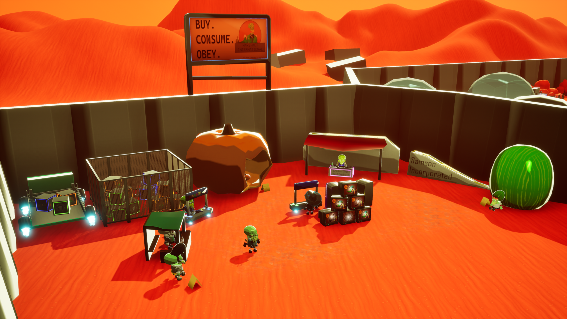
As seen by the end of Beta, we also included a large monument at the town centre (5) as a way for the player to know where the centre of the map is at all times, helping them navigate and understand where they are on the map. At the beginning of Beta, the Market was very bare and had barely changed at all through Alpha, so when we developed that location, we pulled the walls and market (3) further in to remove some of the blank space we had, but the new design of the Market Stalls really helped to intrigue the player into exploring a location, especially with some of the more odd-shaped stalls. During this period, I also developed a blueprint that would move one of the vehicles around the town centre to add some more moving parts and help bring the town to life even more.
On reflection, the improvements made between the end of Alpha and Beta are very substantial and positively impact the direction of the game. This version helps the player navigate the level a lot more, as well as having several places that can help bring the player's interest to a specific location. Another big factor that I think adds to the level is the reworked lighting to add a more orange tint to the world, and the addition of intense god rays really makes the environment stand out more. I think the level could benefit from some more static assets to fill in the blank spaces, similarly to the night map.
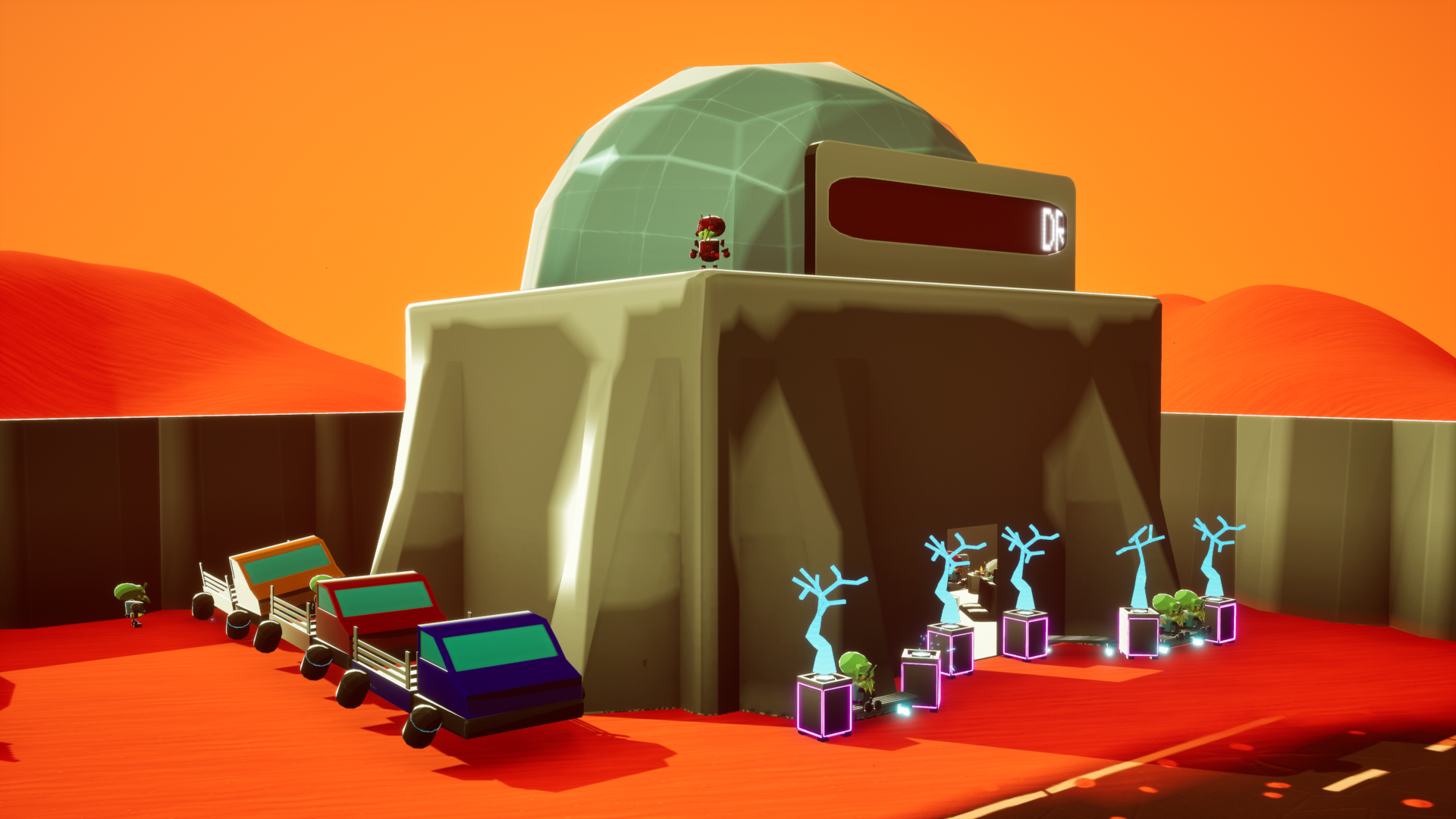
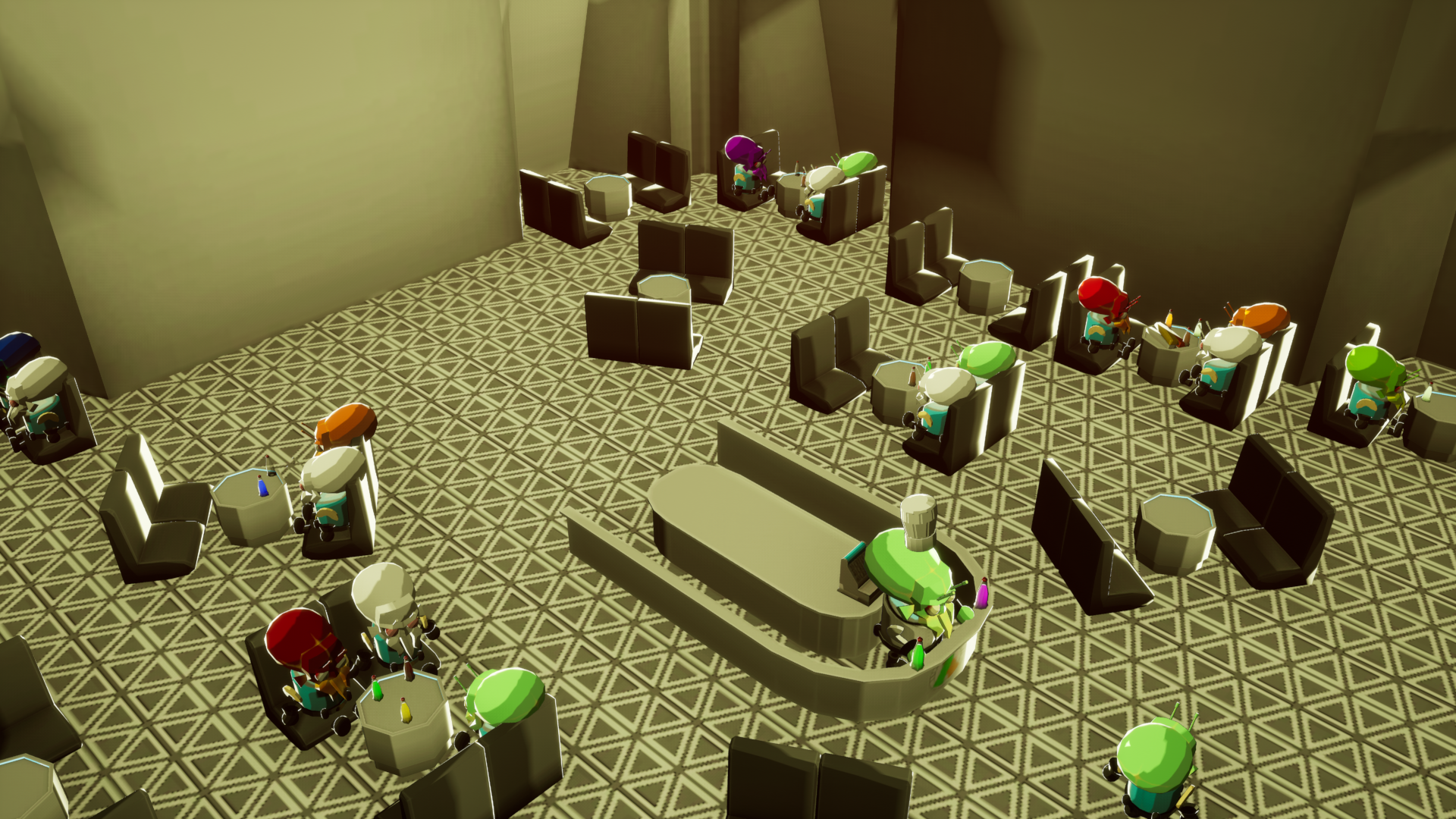
The Cantina also had a dedicated model created for it in the style of the alien houses, to fit with the consistency of the other locations. We wanted this spot to be a location that we could populate with several fun references, helpful mechanics to aid the player, and a stand-out location for the player to explore. The Cantina is a very atmospheric place, and really adds to the belief of the town being populated through the variety of characters inside the level, and accomplishes this alive and busy feeling that the Market doesn't quite get.
The only issue with this location is that the player camera can go outside the building if they are inside. This is because the model's walls are being treated as planes, and I should have added some thickness to them to stop this from happening. The other issue with the design of the Cantina is that it's quite a large model, but feels very empty above the ground floor; it could definitely benefit from some walls to break up the layout. The only real issue with this is that because the model is one whole piece, it can't really have these changes. In future, I should do large buildings as a modular collection or even have the interior as a separate level. I think to also create a more realistic depiction of a cantina, I should include more empty glasses around the Cantina, use some decals to create spilt drinks and even dirt along the floor to add a more lived-in feel to the building.
By this point, the basics of the game's code were complete; it just needed to have the style and flair applied to it as well to make it fit in with the rest of the level. We spent some time thinking of different stands that we could include to add some style and continue the trend of pulling references and parodying real-world elements. We took this as another opportunity to expand what we are able to do and present to the player, including the TVs that change between different advertisements, using the same method as the Inventory Animation.
However, doing the animation for a model presented a different challenge. We used already made 2d elements for the advertisements inside After Effects before exporting them as individual PNGs. For the animations, I didn't make the model they were being attached to, so I had to make sure that the image I was going to add fit with the UV of the TV Screen. To do this, I separated the screen faces by giving them their own material, and changing the material to show a frame of the advertisements. Using this method, I was able to scale the UV to fit the advertisements and reimport the model into UE. This allowed me to assign a new material to the screen without affecting the rest of the model.
We also used this as an opportunity to add some more fun elements for the player, letting them purchase hats or spend credits to make one of the Martians Dance, these are unhelpful mechanics to the player, acting more to help build immersion and fun to the player's experience.
I think this is a vast improvement on the original design of the Market, and has some immersive and fitting additions to really add to the fun nature of the game. I think to really improve this further, I could include more market stalls to fill out the area even more, giving it a more cramped and crowded feel, even by adding more moving NPCs as if they are purchasing and inspecting goods, helping to make it feel more alive for the player.
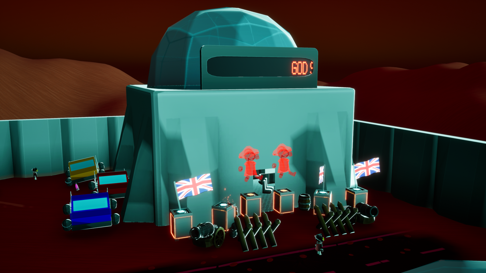
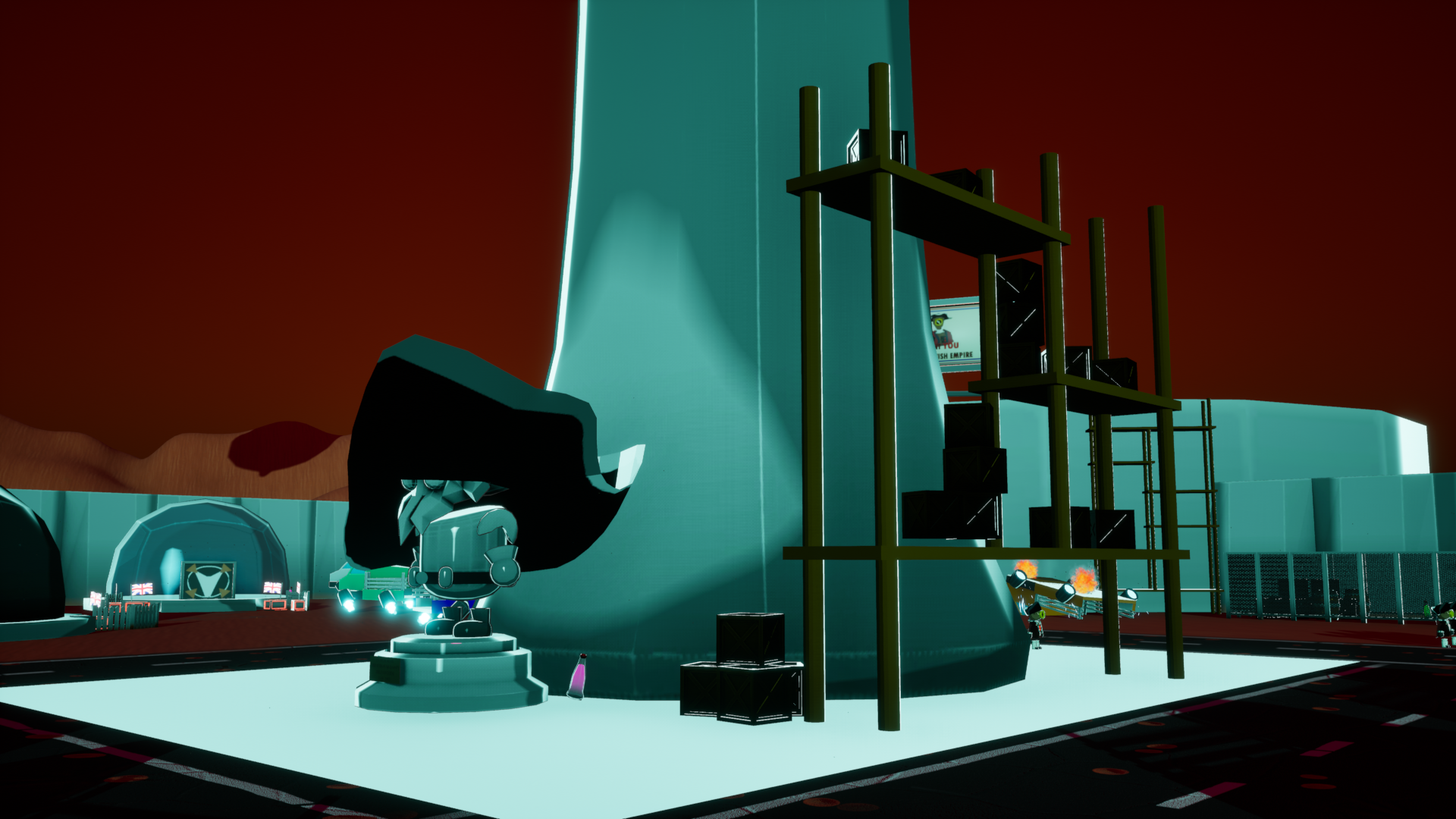
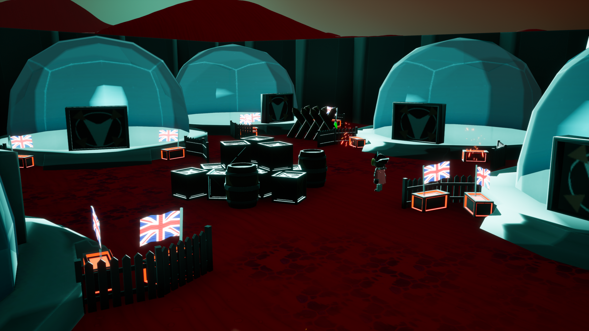
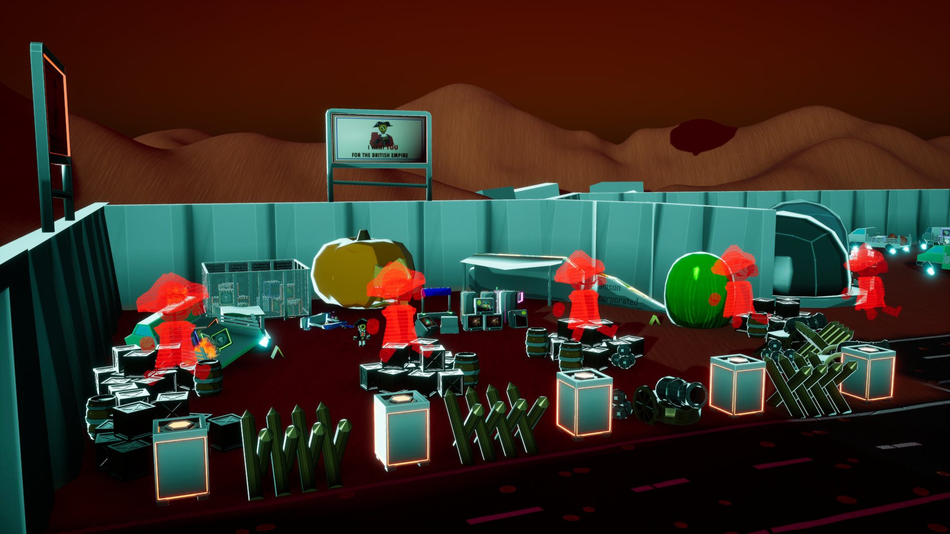
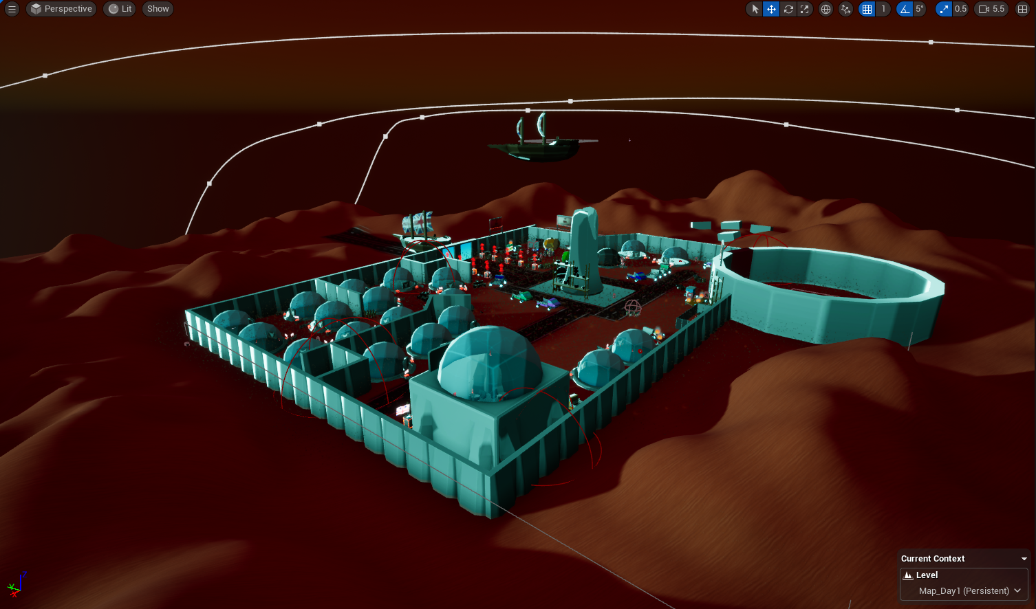
With the final significant landmarks of the gathering phase map added, we were finally able to begin adding elements to the night map to make it look like the level had been conquered by the Redcoats, and to make it fit with the overall design and aesthetic that would go with the 16 - 1700s style. Being a game that heavily revolves around stealth-based mechanics, we wanted to achieve a similar element of providing cover to the player, so that they could remain undetected without having to use the invisibility and stamina resources they have. This worked well with the crate model, working as a simple model we could easily stack on top of each other. We also developed some standalone assets, such as the barricades and the cannons to act as siege weaponry, to just build the story of what the Redcoats' intentions with the town truly are.
We also wanted to keep some similarities between the Day and Night, not changing the significant areas too much so that they became unrecognisable to the player, but we still wanted to really create the sense that the Redcoats have successfully taken over. Several of our assets are made in a way that we can easily change some of the materials to be different colours and styles to remove the need to totally re-texture or change the model further. Since the trees and pots could easily have the material instance modified, we could change the colours a lot to be anything, but we went with a red to fit with their colours a lot better. We also switched the holograms to be Redcoats saluting as a sort of propaganda element to the level. Since a lot of the alternative designs were separate assets from the original, instead of placing the new asset several times and copying the location of the old one, I used the replace asset button to help make this process a lot faster and easier.
Finally, to make the scene feel like it was set at night, we modified the lighting to sell this effect. We once again used the Environment Light Mixer to achieve the lighting effects, and modified the intensity of the scene's lighting, but modified the sky atmosphere to create our blue lighting. When we did some research into how the environment of Mars looked during its night period, we discovered that the lighting was a blue colour, so we wanted to recreate this in the engine. To help with this, we messed with the Sky Atmosphere's Rayleigh, Mie, and Absorption, changing the colours to help create this bright alien blue, as well as changing the sun itself to be blue.
The night map is a perfect addition to the game and finally brings the game very close to the original design we first documented in the GDD. The level works so well with the intention of fitting with the whole stealth genre, providing cover to dodge the view of the Redcoats, and is a good way of changing some of the empty and blank spaces to fit with the Redcoats' whole aesthetic. I think we could include more cover for the player, and maybe even more enemies for the player to dodge, but the current situation works perfectly well. I think this level is also super enhanced by the lighting once again, adding this great transition between the very clear day and obvious night style.
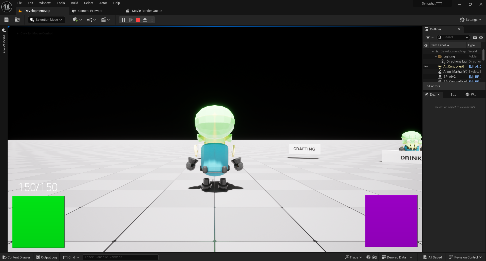
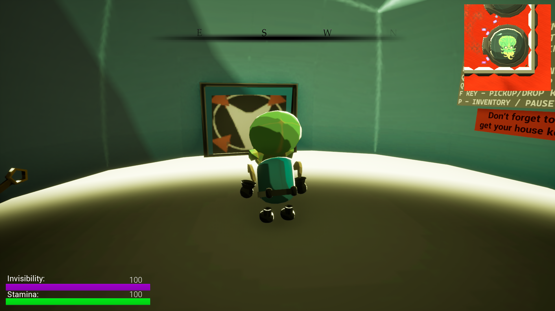
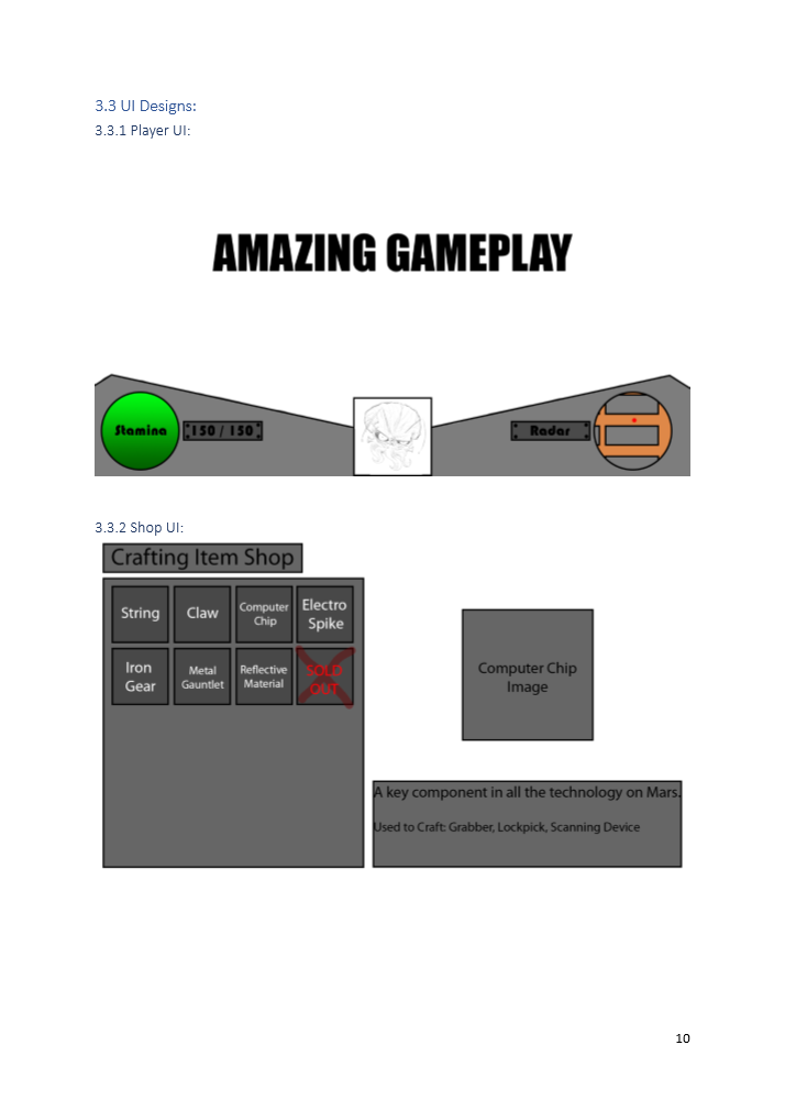
At this stage in Alpha, we created a very basic UI for the player, keeping the two different bars in the positions we documented in concept sketches. Unlike other games I've worked on, this game has a very unique shape to the different bars, being square rather than the typical bars I've done before. We plan to overlay an image to make the two squares look like circles, adding a more unique spin on the UI. The UI shows the two player stats, Stamina and Invisibility, both finite resources that the player will deplete the longer they play. We decided against a health system since the player would be caught by enemies rather than take damage and be able to run away and survive. Having Stamina and Invisibility as resources that won't regenerate, we needed a way to make sure that this didn't become a permanent roadblock for the player, so we included consumables around the level to help restore this. The UI itself is created through the level blueprints when the level starts and changes the values of each bar through a looping function inside of the player. For the UI to actually update the change in Stamina or Invisibility, the percentage bar is bound to a function that will always check for when a change occurs. The only significant thing to remember with this is that the stats amount must be divided by its total so that the number fits between 0 and 1.
In comparison to other elements of the UI that we have created, this is the most basic, and although they are only two squares in each corner, they do take up a significant chunk of the screen, so reducing the size would definitely help improve what the player can see. It hasn't got much going for it in terms of style, but it works well enough to get the concept across. To help make it more understandable and stand out more, we should consider labelling the two bars to help players understand the use behind them, as well as working on some elements to make it more significant. One thing we've considered is drawing inspiration from the original Doom design and having animated faces that play when the player does specific interactions to add more fun to the UI.
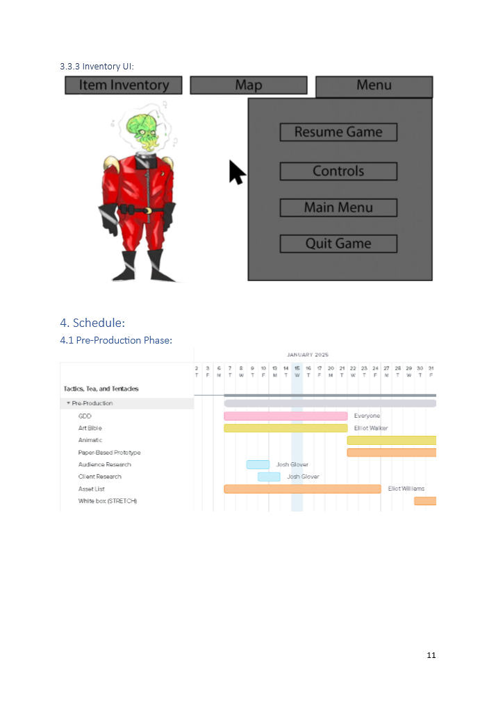
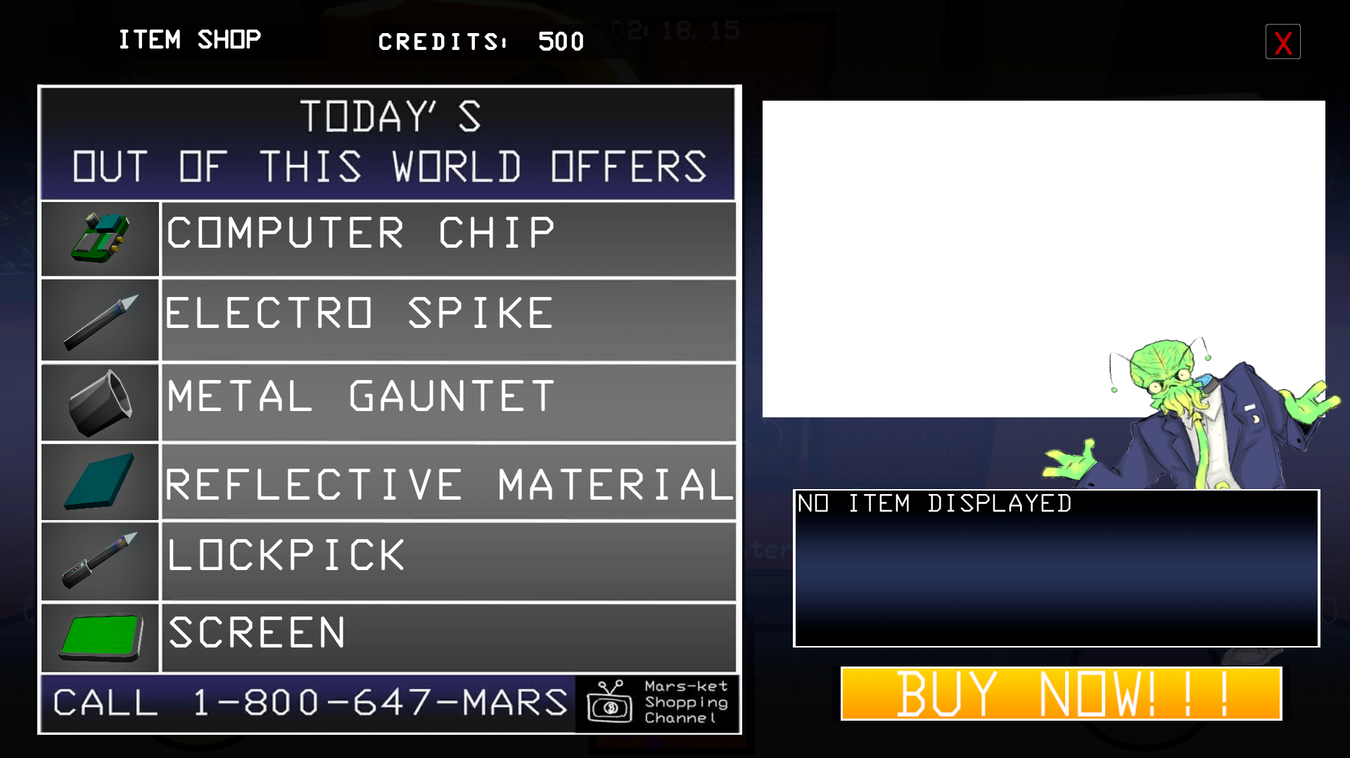
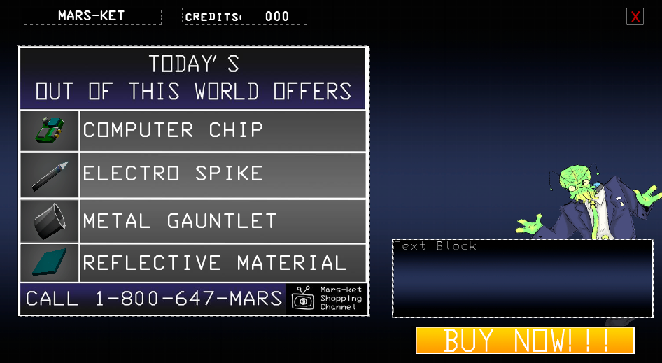
A significant part of the game is the ability to purchase items from the Market, so throughout Alpha, I spent several sessions working on building the UI as we get more and more elements developed for the game. I wanted to have a proper shop layout where the player could visually see the item they wanted, alongside the name of the item, and selecting it would give them information and a closer look at what they'd chosen. However, this was something that I hadn't looked into. So getting an image to change when you clicked a specific item would not only be a cool piece of information to know, but also really enhance the overall design of this UI.
To accomplish this, I had a specific image that would be the basis for the images to change, as well as a scale box and text to ensure that no matter what the text variable was set to, it would always fit. The buttons along the left side of the screen would be clicked, setting the image, a string to the chosen item, and the text box to the item's description. To actually change the image, the buttons would use the Set Brush From Texture node and be allocated the correct image; at this stage, we used default engine images to know that this definitely worked.
As mentioned, this component requires the use of strings to check what the selected item is; this was to make sure that when the player did purchase an item, the correct amount of credits was removed, as well as giving the player the right item they had purchased. During a recording, I found an error where the items weren't priced in line with the text alongside them, showing the benefit of testing each element as much as possible.
The inclusion of the text box also serves as a benefit to the player experience, allowing the player to get all the relevant information without having to go into the inventory to check what they constantly need, as well as using the same images to help the player become certain of what they need to purchase. This is also one of my favourite UI elements that I have created; the original design without any 2D assets was a step in the right direction and exactly how I planned for this to be expressed. I think to add a little more style to this, I should look into making an overlay that makes this look like the static of an old TV to sell the design of a teleshopping channel. Although the 2D images do help with the overall aesthetic of the element, it does force me to line up each element to that, when I could have used horizontal or vertical boxes to keep a consistent and equal layout between each item.
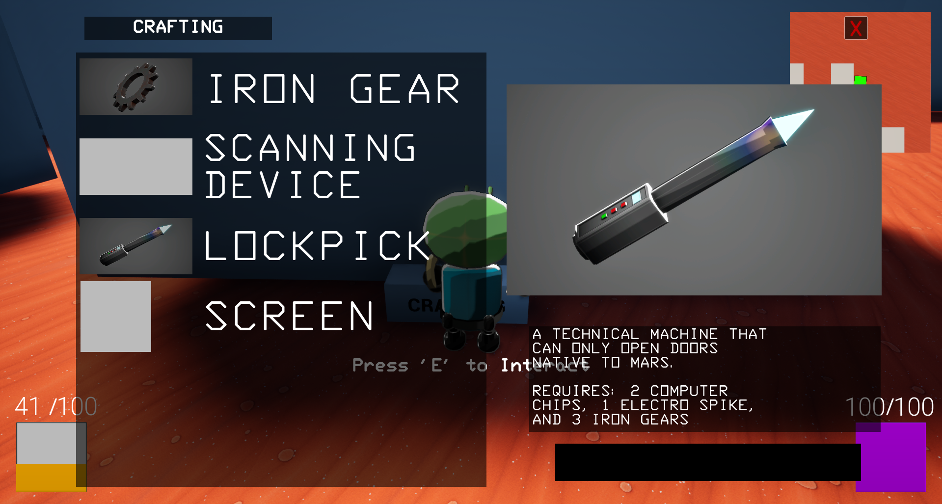
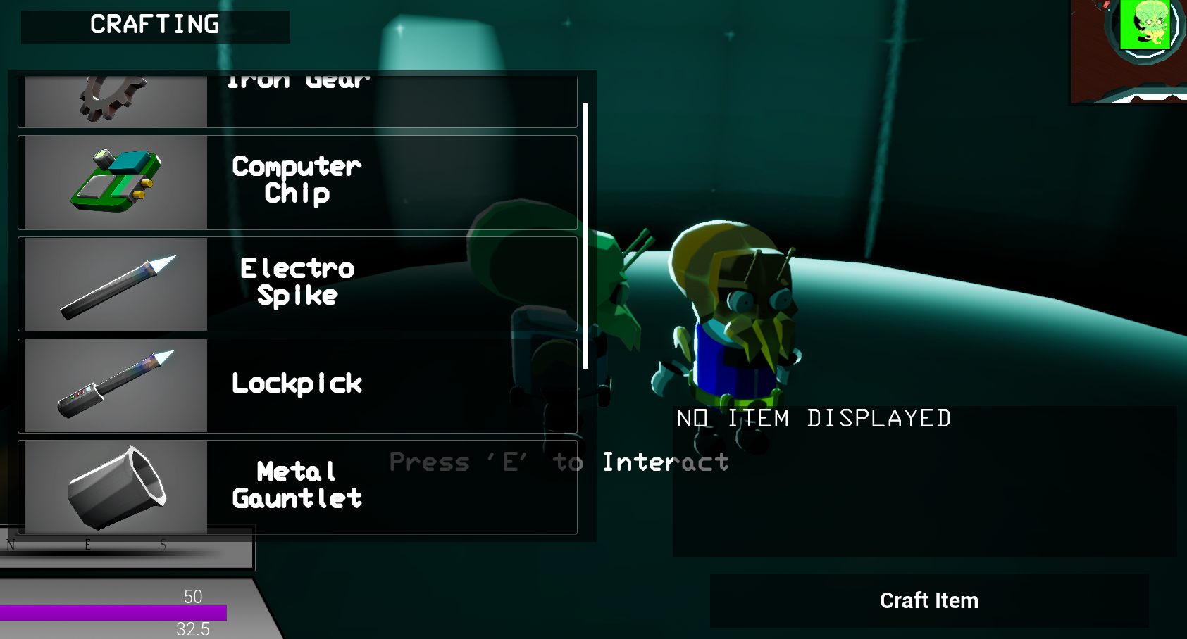
The Crafting UI is a significant element inside the game, but doesn't come with as much charm or personality as the Market. The two of them share a very similar set of functions: click on an item and see a closer look and the information about how to craft it and what it can do. The biggest alternative to the Market UI is checking that the player has collected enough resources to be able to craft the item, which, if they haven't, will print a string of text saying "NOT ENOUGH MATERIALS".
I think to make this UI stand out more, it could really benefit from the same fun style as the other UI we have to make it stand out from the others. Our current idea for this is to create a mechanics house, which will serve as the person creating the items for the player; we could do a similar drawing of a Martian to appear onscreen to help express this further. Another change I would make to this is when a player crafts an item, it is unclear if they have successfully done so, unless they check the Inventory UI or to press the button several more times to know they have run out of items to craft it. An easy fix for this would be to include a sound that would play when the player crafts an item, as well as a clear denied sound, so the player knows they are unable to craft these items.
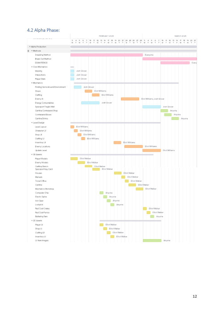
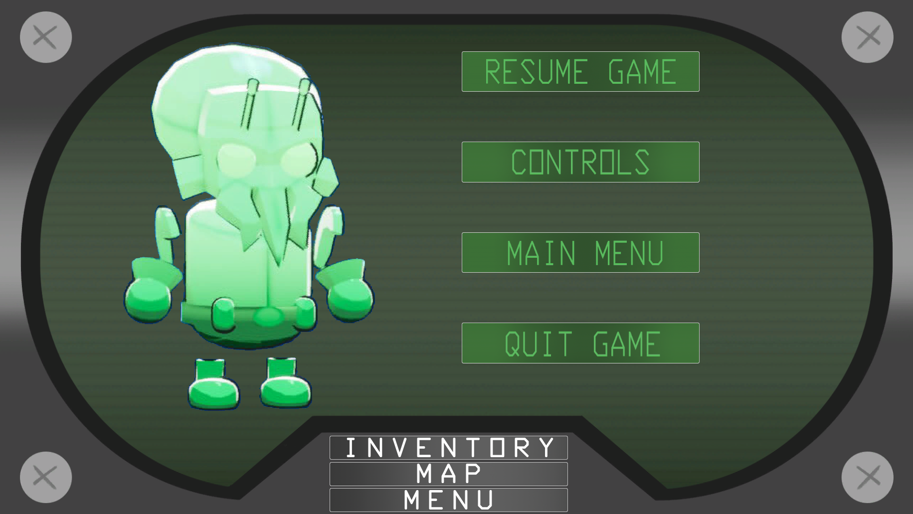
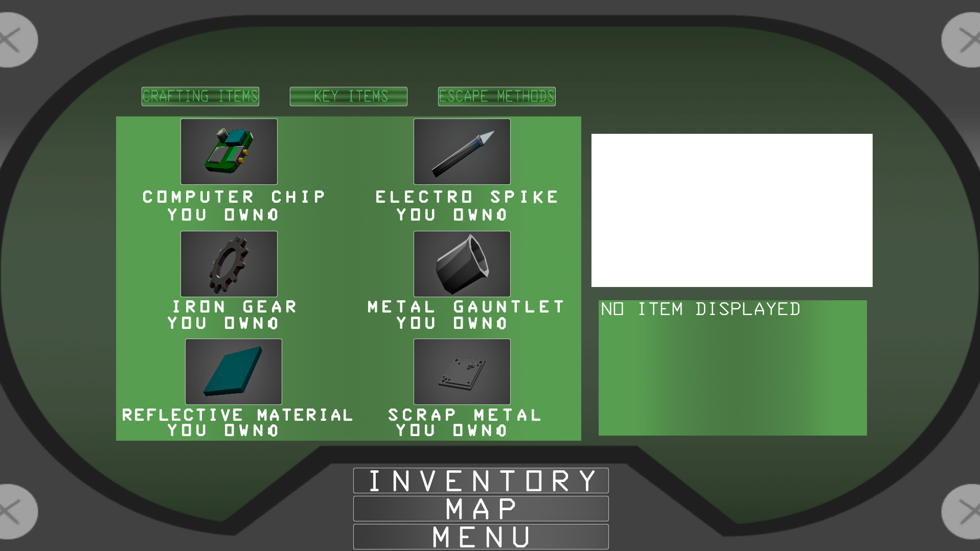
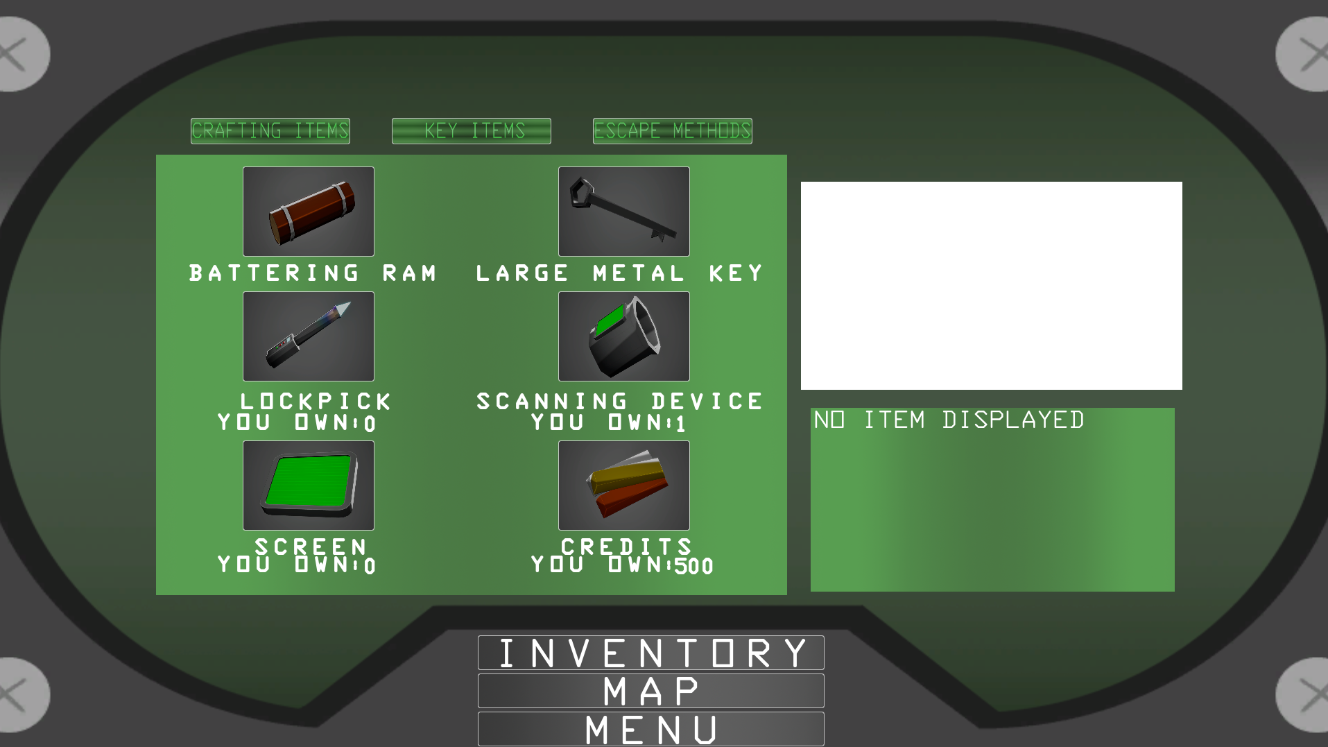
When developing the Inventory UI, we originally kept it simple to get the basic functionality down, and making it easy to navigate for the player, having every button clearly labelled for the player to understand. I also wanted to have it serve as a guide to the player, allowing for them to learn simple information about the game through the UI. It's a significant area that has always been overlooked in other projects has been guiding the player to understand the basics of the game, so having the Inventory serve as a documentation for the amount of items the player had was essential, also allowing them to know where they were going, how to craft items, or what they were following was a significant help towards the player experience.
One of the best and unique elements of this UI is the rotating image of the Martian, which really helps to separate this from how similar in functionality this is to the crafting and market UI's. This was one of the more fun elements to create, which at first we created by using the same scene as all our model renders. We used the invisible materials in a green colour to fit the rest of the colour scheme, so to effectively capture this, we changed the background to be Blue so we could easily mask it out inside of Adobe After Effects. We also added a rotating movement to the asset, so we could use a video capture to get a full 360 rotation of the asset. Inside After Effects, I used the Key Light effect to remove the Blue Screen and create a transparent background. With this being a UI element, we had to export the full 360 video as separate images to make up every single frame.
Finally, to actually create the moving image, I imported every individual frame into the scene and made sure they were in the correct order. The next step had me creating a Texture Array, which, if the frames were not in the correct order, would cause the animation to work incorrectly. With the Array, I could then create a material using it. The Material needed to be set for UI rather than a model, so using the texture coordinates block, I could use that alongside a Time multiplied by the frames per second (30) and then use a FMod to get the divisible outcome between the total frames and the FPS. Pairing that with the texture coords allows for the texture array to be cycled through, creating the moving Martian.
The updated version that is currently in the game was a huge upgrade on the original design, adding so much more personality and style to the element, as well as really differentiating it from all the other UI in the game. Once we finally have every item inside the game rendered, the UI will stand out even more and serve as a very useful guide to the player and their experience. I think to help improve the player's experience with this UI, we should overhaul the Escape Methods Tab to allow them to follow the chosen methods and the steps they should take to complete them. This would work well with an objective system to help them understand the fundamentals of the game even further.
Throughout Beta, we tested several different styles for the UI, originally settling on something that covered the whole of the bottom of the screen. We took inspiration from the original Doom with this design, originally wanting the bottom middle to be the face of the Martian and expressions depending on what was happening in the level. We wanted to also have the Stamina and Invisibility as circular bars to fit with the Sci-Fi style. Another addition to this UI is the Mini-Map and the Compass Bar. The Mini-Map is attached to the player, capturing the scene from above them and changing that into a texture designed for the UI. The compass bar uses a single image that moves with the player camera, as well as being used to add markers, which, in the above image, were used for specific landmarks.
However, as we continued through Beta, we decided we weren't big fans of the UI element, taking up too much of the screen. We did test making it smaller, but it just didn't look right. After much deliberation about the Player UI, we settled on just going for a more empty look, feeling similar to the simplicity of Alpha.
The Player UI proved to be quite a difficult element for our game. We never really felt like we had a clear vision or understanding of what we wanted to actually achieve with this element. The original design achieved at the start of Beta definitely has some style to it and feels very immersive, but also plain. I think it was interesting to test with the shape of the progress bars to see what worked and what didn't work, but the typical horizontal bars work better in my opinion. I also think that the uses of the Mini-Map and Compass Bar are quite useful to the player, but need a more designated home and design to them. Personally, I think the Compass Bar looks out of place being so far down from the top of the screen due to the position of the timer.
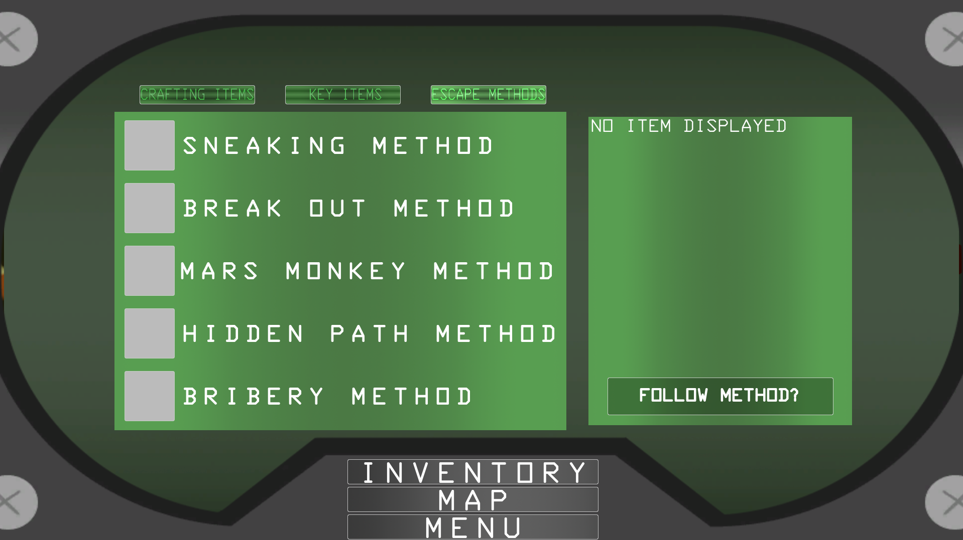
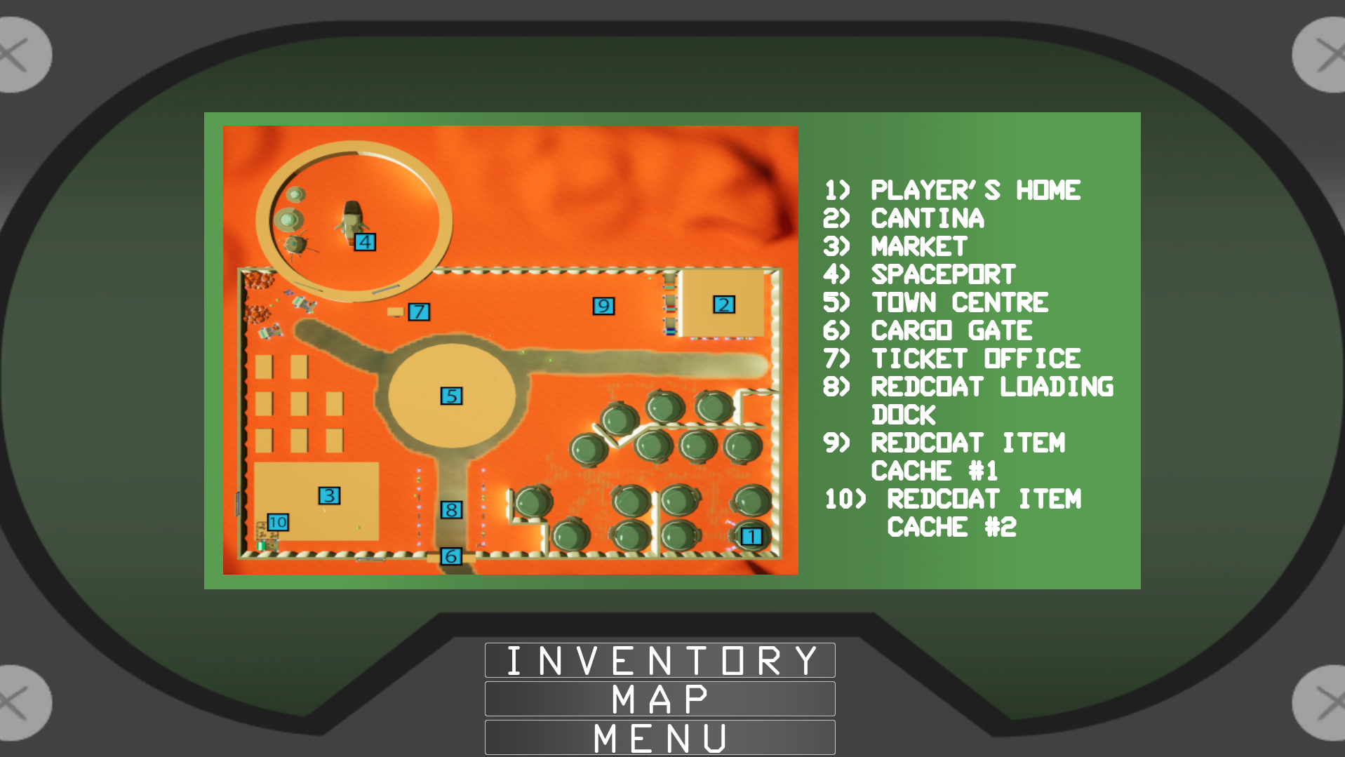
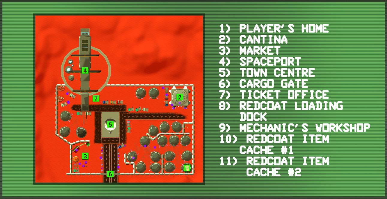
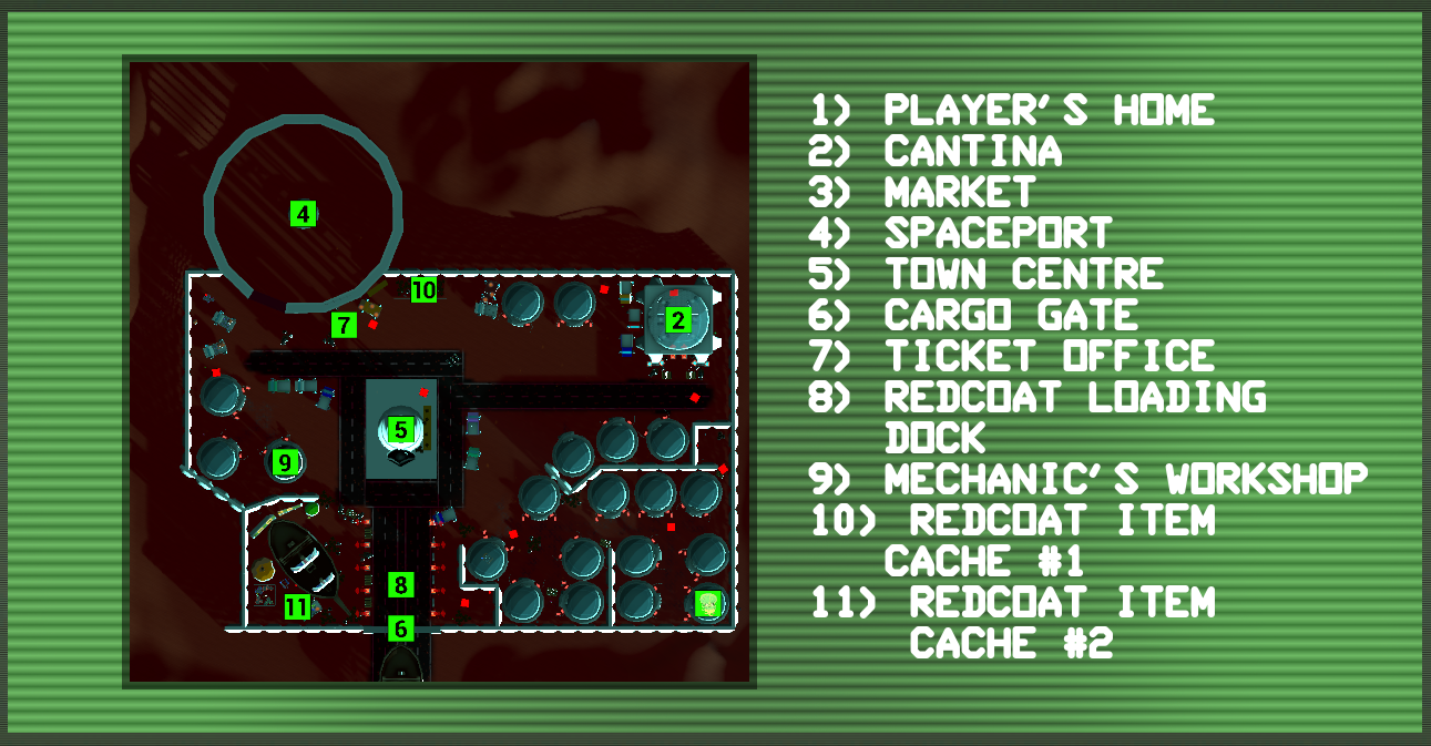
With the Inventory UI, we finally added images to all the remaining items to finish the consistency between the Market and Crafting UI and to help the player correctly associate the different items with what they are used and needed for. More significantly, we added the ability to select a specific method that comes with its own compass markers and objectives to follow; this allows us to give the player more guidance on the method they are following, rather than the vague paragraph alongside each method. With the level also changing with every addition, we updated the map to be a static render of the map from above so that the player could navigate it a lot more easily. The Map itself is the rendered look of the current map, which I brought into Photoshop to crop down and add the numbered markers to help the player navigate the environment.
I think, similarly to the other UI images, the UI needs to have the white box invisible to make it fit with the overall aesthetic, as well as having the Escape Method tab have an indication as to which method has been selected by the player. Something that could also benefit from a change is the Map image, having a real-time view of the level so that the large ship isn't always in the way, and helping the player see where each NPC or Enemy is currently at and removing the confusion of seeing both Day and Night markers during the day.
A small detail with the UI that I mentioned I wanted to change, since it looked odd, was the image box that we would change to be the image of the selected item. To fix this, I changed the boxes' material to an entirely invisible material intended to be used inside different User Interfaces, which worked really well since we changed the image material to the renders. Because of this method, we didn't have to change the image's starting opacity to zero and then turn it back up when adding the image to it.
This is quite a subtle change to several different UI's, but a very effective change, adding a more polished look to them. It really helps to maintain the overall immersion of them, and doesn't break the player's experience by having a large white rectangle intruding on the screen.
The Crafting UI is probably one of the most unchanged and forgotten elements of the game, which was most certainly due for an upgrade by the time we reached Gold Standard. During the week that I recorded all the gameplay footage, I was recording the Hidden Path Method, the longest method in the game, which requires a lot of different crafting items to make the Scanning Device. After recording for nearly seven minutes, I got hit with the huge roadblock of being unable to finish the method at all since the remaining items were missing, which not only was a huge time waste, but super annoying when I didn't want to have to restart the game to potentially not even complete the method again. The easiest solution to this problem was to use the already existing Scrap Metal and use that to craft every other Crafting Item so that players wouldn't get stuck in this situation no matter the methods they follow.
This was a good change I was going to make, but the clear issue was that not every item was going to fit onto the box we had, so I decided to use a scroll box so that I could have every item fit inside one box and simply scroll down to find the other options. I changed the whole item to be a button, with the image and text alongside it, to keep it inline with the original design. I also added a larger amount of padding to these buttons so they weren't as tight to each other, and I used the same code for the Iron Gear for the other items, since having the different crafting items cost different amounts didn't make sense.
This was a brilliant improvement on the overall design and function of the Crafting UI, not only benefiting the player and dodging potential issues with the player being locked out of following the method they originally wanted to follow. It also got some unique elements that aren't used in any other UI, making it stand out a lot more in comparison.
A significant piece of feedback we received, and something I noticed myself, was that people would check the map in the inventory and would become confused in relation to where locations really were since it was a universal map for both Day and Night. However, to enhance this feature further, I used the same 2D capture as I did for the Mini-Map and placed it above the level to capture the whole scene. It worked really well with the NPC and Player Icon to see where you and they are, as well as creating a numbered marker system to help the player still follow the key included to the side of the map. Since we used this system during the day, we also had a copy during the night, so when you look at the map, it fits the lighting and includes the Redcoat-related markers.
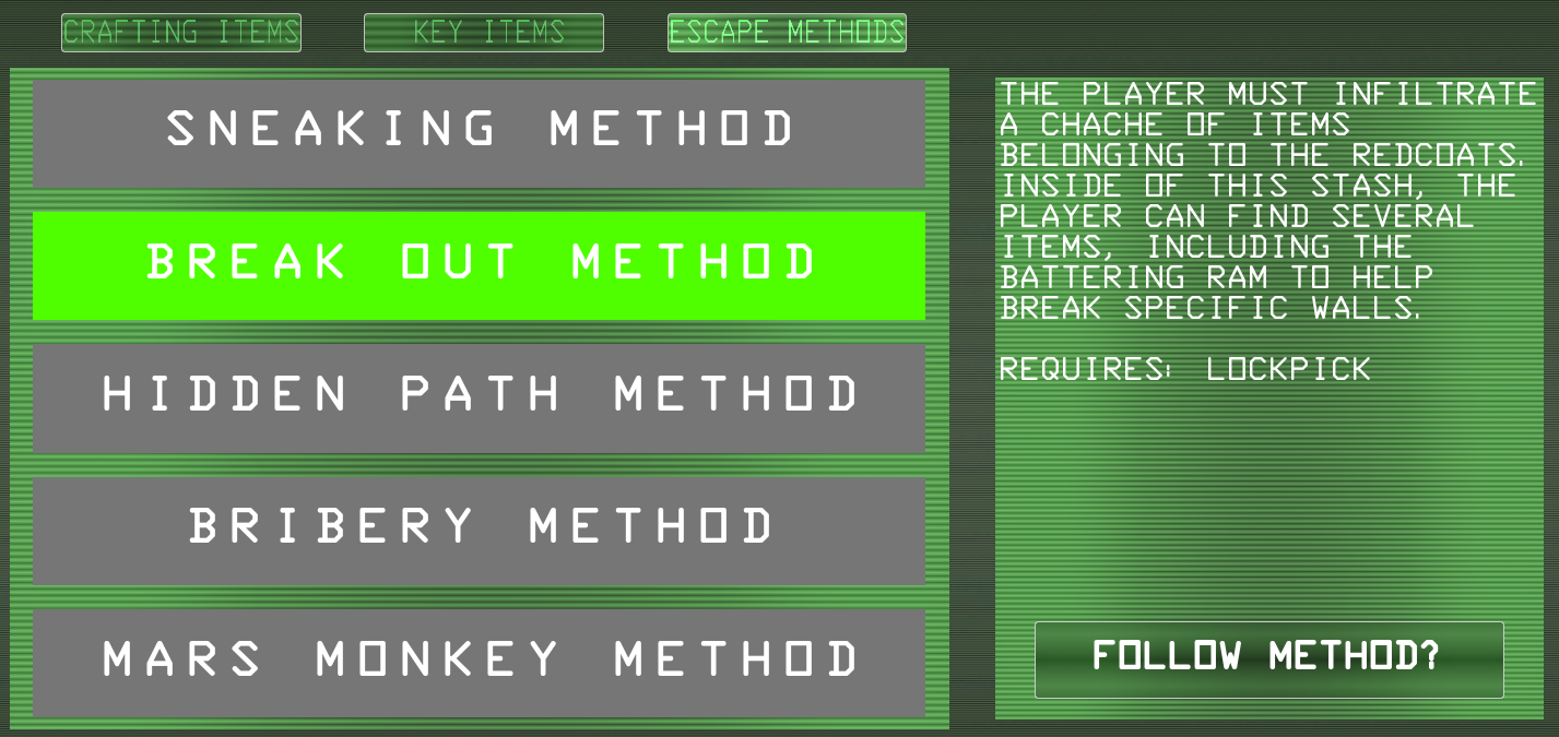
Finally, a change we wanted to implement in Beta was using the buttons of the escape methods to show which method you were following when you interacted with it. I spent a lot of time reiterating this design, trying out using an image inside the button that would change when you swapped methods, but couldn't get this to work and decided to look into a different method to achieve this effect. To equally space out the buttons, I put them inside a Horizontal Box, which did put each button super close to each other, but adding some padding helped add a gap between each button. Finally, I used the chosen method from the player to set the button's colour to be green and changed all the others to be a default grey, so the player knew it wasn't selected. A huge benefit of also using the Horizontal Box is that it helps to reorder each button without having the trouble of keeping individual items inline and in the correct location. So when I made these changes to the Escape Methods, I moved the Mars Monkey Method to the very bottom, since people will most likely overlook it, and it's not an implemented method, whereas the other four are.
The Map change was a very useful addition, helping the player see where every moving part currently is when the game is paused. It also meant that we didn't have to keep rendering an overhead image every time we made changes to the level and add new markers over the image, which is a huge time saver in the long run. Although the Escape Methods didn't require the changes we added to them, it definitely improves the player experience of being able to know what method they are following and what items they can look into to complete the playthrough. The only issue with this change is that it makes me wish that I'd have known about Horizontal and Vertical boxes sooner so that I didn't spend as much time throughout different User Interfaces to line different images and text boxes perfectly in line with each other.
In comparison to other groups and projects we'd worked on, we wanted to have something that really made us stand out in comparison to other art styles. So a little further into Alpha, I looked into creating a material that would take our textures and apply the cel-shaded look onto them. Because this was a later addition, we already had several models without the shader, which still looked good, but with the inclusion of the shader, it really elevated the designs and added a lot of style to them. The shader was created through a material function, allowing me to set up a process for the material, then use it as an instance to further edit it. The Function created several bands of light to add contrast in colours, as well as enabling us to give the materials fake sun positions to help make models stand out better.
The Material Instances were something that I myself hadn't experimented with or used before, and really opened my mind up to how useful they can be, allowing us to essentially parent a material down a chain that we could modify on its own or through the parent. This was especially useful for when a model didn't have the best lighting when placed into the level, so having the option to add a fake sun and change the position through the instance saved a great deal of time in a lot of areas and provided solid results.
Similarly, I had never tested with Material Functions, which significantly helped with the style we were going for. The Material Function is a dedicated location for a whole material to be set up through many material nodes and resulting in several outputs to be easily transferred into a regular material, and then onto an instance. This helped us build a chain of information being passed down from source to source.
I think the shader really helps to enhance the level significantly more than having models that only use the smart materials. It gives every model a really nice charm and provides the flexibility to alter and change the style of our textures even further. I think we could mess with the settings further to get some even better results rather than keeping everything at default values, to see how much detail we can really add to our models. Another drawback of this system is the requirement that all models have been smoothed correctly to mask the individual faces of a model. This was something we encountered very early in the creation of the shader, which was easily fixed by making sure all developed models were exported and textured with no smoothing, but we imported the smoothed version to have the material flow correctly. Although this was a small issue, it did come with the benefit of realising when a model had topology issues because of how the faces would flow through the shader.
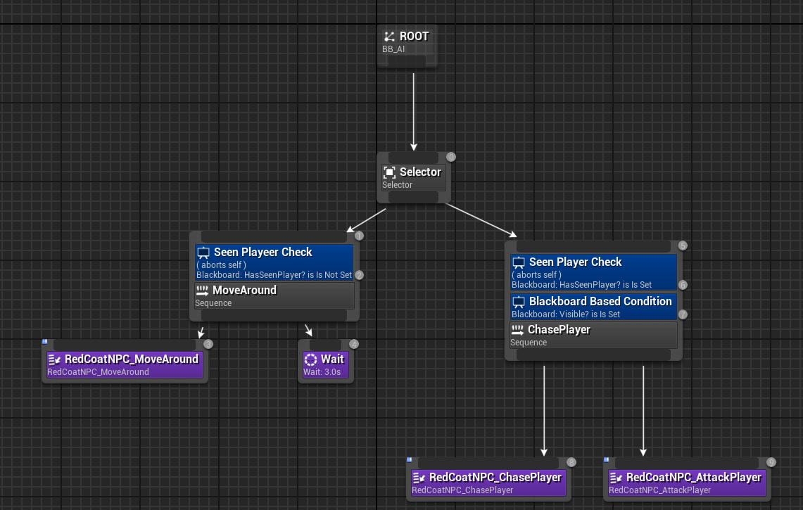
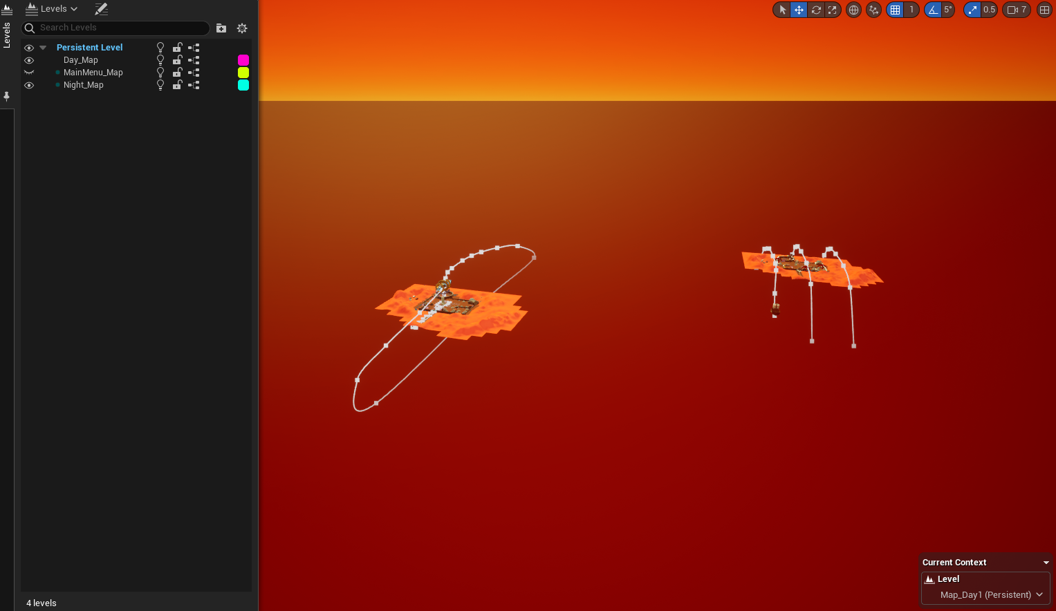
The enemy AI is a key component throughout the game. They use behaviour trees to follow a set of instructions to either make them move around or chase the player. The AI itself uses the Pawn Sensing component to allow for them to sense sight and sound, which currently only has functionality of sight. The behaviours also follow a boolean attached to the player that changes when the player is invisible, allowing you to move undetected. The movement of the AI uses a vector array to hold several locations that the AI then cycles through using the AI Move To block, where they then wait for a couple of seconds before moving to the next. When the AI sees the player, it will move towards the player and, within an acceptable distance, create a sphere trace that, if it detects the player, broadcasts a message to the player to take damage and ultimately end the game.
Enemies were something that I dragged into the level, but had individual instances that could have vector locations applied to them so they can patrol through a customisable set of locations. This was also paired with variables that would interrupt this section of code when they could see the player.
The AI works really simply, and I'm happy with these results. However, the AI, on occasion, looks like it changes its mind on the location it wants to move to, which does work as a way to throw the player off of the typical movements, but is entirely unintentional. This is most likely an issue with the behaviour tree itself, which I'm uncertain where it is coming from, but something I could definitely improve upon. I think it would also be cool to incorporate sounds that the AI could hear and attract them to the player to really lean into the stealth genre of games.
At this current stage, there are few enemies around, which makes playing through the game pretty easy, so throughout Beta, as we upgrade the aesthetic and level design, we can populate the scene to include more enemies and make them seem more uniform by patrolling around like a soldier. This really helped me understand how you can get a piece of data from an array through the use of an integer.
Level Streaming was a late addition to the game, but a change that I think really benefits the overall game. Level streaming allows us to have one main level and open sub-levels as we see fit inside of the main level. This worked quite well when we wanted to create two maps with some differences, allowing us to copy and paste and assign them to a new level. Level streaming also works really well with a loading screen, allowing for us to have an actual functioning screen.
Typical level opening in Unreal Engine doesn't allow for a loading screen since the level you were previously in will get cut off depending on where the UI is made visible, but the transition between the levels causes the UI to freeze, which, if it's removed after the level loads, can't be utilised to the best of its abilities. However, because level streaming takes place during gameplay, the Loading screen can be utilised and has some movement to it.
Another benefit of level streaming is that it allows us to keep variables the same consistently, without having to store them in a specific place. Before this, our game used a Game Instance, which can save variables and the values given to them through levels; however, to take advantage of that, we have to cast to the game instance every time, which can be quite annoying, whereas with level streaming all the variables could be assigned to a component or actor and be persistently used with no impact on performance from casting.
Level Streaming is an incredibly useful tool that can very easily help to cut some need for casting to a game instance, and can have some very positive effect on how the game runs. However, if there were a way to improve this, I would completely change how the streamed levels are set up. I would have the landscape and the buildings as their own level, or even a persistent collection of assets since both levels use them. I would then further add two more levels, with the relevant assets for day and night, which I could load in and out. This would allow for an even faster load speed instead of opening another level to load the same things in again.
One of the key pieces of feedback we received from Alpha was the different ways we could show the player where to go; one of those ways was through a compass bar and markers to help the player move around the method they wanted. The compass bar was a good addition to the game, working as a great way for the player to get their bearing in the level, but adding compass markers, especially combined with following methods, would help the player navigate even further. When we first implemented them, the markers were solely used to mark the location of the method, but we did also test having persistent markers around the level for the home and cantina.
The compass bar went through several periods of development, getting them to work correctly, be in the right places and be removed when they needed to be. This, however, presented a whole heap of errors and issues that I couldn't figure out. When developing the Hidden Path Method, I tried to have the markers appear when you were so close to them, but once the actor was destroyed or the player left the area, the game would generate errors. So after much head scratching and bug fixing, we ultimately decided to take them out of the game. As useful as they were, the errors that came with them couldn't be overcome, so we turned our attention away to other means of guiding the player.
Although the markers were left alone to be revisited another day, I did learn a chunk of new information about them. I experimented with using an actor component that could be triggered through the actors it was attached to, which opened my eyes to how components can provide similar services to actors who would be affected by similar things, for example could be used for a Stamina and Health system that could be utilised for the player, enemies, and NPCs! It also helped me understand having materials that could move with the direction of the player camera, using the same Material Parameter Collection as the Spaceport Wall.
As mentioned, we looked into having more than one way to help the player move around the level and understand where they are going and what they can see. One of these new additions was the inclusion of the Mini-Map, showing a small area around the player and having enough detail to make out items, as well as being a live capture of the level, allowing for the locations of enemies and moving components, which can really help through both day and night.
To really aid this system, we also created objectives that detailed each method with enough information to help the player, but not too much that it makes it seem you are holding the player's hand the whole time. This was a simple scale box with text that would be updated through an actor component as the player completed them. I utilised an actor component to hold all this information and assigned it to the player so they can trigger the objective system at the beginning of play. The objectives are broken down into each method that can be checked through a string. The objectives follow a long line of branches to make sure the player can advance to the next location, which I programmed to ensure that the method can still be followed regardless of what the player chooses. Partnering this with the marker system also really elevates it to the next level and helping the player navigate the world easily.
Although we are testing other ways to help the player navigate around the map, it would be a great addition to actually have the markers and have them work with every available method. With the code still being there, I could very easily revisit it in the Gold Standard period to refine and implement it accordingly! Although I think the implementation of objectives is definitely a big help for the player, allowing them to follow the method they want easily. There are some issues with the system that have come to my attention, such as the objectives only being something the player becomes aware of when they open up the inventory, which they might not do, so having the default value as guidance to get the player to see the inventory and set a method would really help the player experience. I also never tested whether the system transitioned properly if the player ends up in the night after running out of time, which doesn't function correctly, so I should consider reworking the system further to fix this small issue.
After our Beta Playtests, navigating the map was still an area of concern; people were still unsure about what they were doing, where they were going and what the ultimate goal of the method they'd chosen was. After previously scrapping the Marker system, it was super apparent that we should revisit and rework the system into the Gold Standard versions to help the player follow a more direct path and not get completely lost inside our level.
The original system that the markers followed wasn't a very optimal system, using event ticks and a large string of branches to check where the marker would need to move to. Not only did this very clearly affect the overall performance of our game, but it was simply a huge mess of strings that we could very easily clean up. I tried several iterations of this system, attempting to use an Actor Component so that I could attach the same system to different actors in the level to get a good level of accuracy in where the markers should be, but this would run into several issues where the markers would try to remove themselves and create several errors, which I couldn't really find a suitable solution for, and ultimately abandoned.
By this point, I was so invested in getting this small addition to function that I would stop at nothing to see it completed. Having taken on board what my previous attempts had taught me, I chose to return to the teleporting marker, especially since it could be a persistent asset outside the two levels I would be streaming. What also helped with this process was that although I had completely reworked the objectives by this point, I'd kept the objective phase variable through each stage, which meant I could use that to help with all the branches I would have to go through to get the marker in the right place. One of the errors with the previous versions was that the Markers would constantly be created through an event tick, so when they were eventually destroyed, it would result in several errors. To overcome this error, at the start of the game, the Marker UI is created and set as a variable so that I can remove and add it to the viewport whenever I need to. So, inside the Marker Blueprint, the loop starts by removing the marker from the viewport and figuring out which objective phase they are at, before adding the marker to the viewport and setting the target actor to itself, so the marker will correctly move along the compass bar depending on the rotation of the player's camera. Since I knew I needed to move the marker depending on each objective, I was checking each objective as its own individual marker, but after realising that I could use the same location for a bunch of objectives, I began reusing the same Objective Phase Number to help with this process.
The markers were typically situated around one specific point that the objective made out to be a clear target, such as the Market, so I could move the marker to that location and copy the coordinates to make that process easier. I did question how I should tackle the marker for when it covered a large area of the map, like searching for a specific item, which, with the whole factor of being random, couldn't have its location pinpointed as accurately as others. My solution to this, at first, was not to include the marker since it wasn't going to serve much of a purpose, but I felt like that was going to confuse people into wondering where the markers had gone, and instead chose to have them appear at the town centre, since the items would be found in a large radius around that location.
The objective system is something I was super proud of getting to function, since the origins of the system are rooted all the way back in my Role Application, back in December 2024. I was really happy with the original system, having thought about the different ways people could end up following the method they chose, but after playtesting in Beta, it was one of the most overlooked features of the whole game, and also didn't function correctly if the player didn't complete the objectives set during the day, or if they chose to start an objective when already inside the night map, underlining just how important playtesting really is.
So to work out every single possibility for each method, I laid out a simple map of objectives the player would need to complete, making sure I knew every possible outcome. The new system starts by checking whether the player is in the night period through a Boolean, which then leads to several branches that are built up to check the final objective first, before going down the list to the previous ones. This system worked a lot better and was much easier to look at rather than the long line of code we previously had. We also made the default objective text actually tell the player to select an escape method, to let them clearly know that objectives are something included inside the game.
With the recent changes to the Compass Markers, the new objectives helped complement that system even more, helping us really benefit the player experience, a large focus of this period. Having the player to visibly read the objective they need to do works well, but we can't fill the onscreen objectives with loads of information to guide the player, but with the Markers, we can actually give a visual indication as to where they need to travel to helping the player get used to the map and key areas the player can explore through both day and night.
I am so glad that we decided to revisit the Marker System, as painful as it was to implement. It is a great complement to helping the player navigate the level, especially with the recently improved level map inside the Inventory UI. This is also a perfect example of focusing on the experience the player has throughout the game, which is a huge focus of this period, rather than pushing to include more and more features and methods that add more elements we need to develop for a better player experience. I think if there is definitely one area that this can improve on, it is having a different style for when the marker is showing that an objective spans the whole map rather than confusing the player as to what the marker is trying to tell you. Alternatively, the Objective System is one of my favourite pieces of programming and my favourite way we've helped the player navigate the world. This is also the best way we've helped the player experience, allowing for the player to comfortably move around this large level and not feel confused or lost when exploring. I think some of the objective descriptions could be written better, and even adding a different tab in the escape methods to add a more detailed explanation to the current objective could also be a decent inclusion for the player to help them more.
During the last couple of days working on the game, I asked my team how they would feel about having a first-person perspective in the game, which we were all unsure about how that would look, but super interested in seeing how this would look and feel in the game. Having recently looked into switching from third to first person, this was a super simple addition, but it provided more trouble with attaching the new camera to a skeletal bone. Since we had an idle animation that had the player move their head, this caused the camera to either show the inside of the player's head or be moved around with the head, which was really jarring, so we had to attach it to the root of the player so that we could position it in the correct place. I also made it so that the player would rotate correctly with the camera by setting the Yaw Rotation, and stopped the player from using their animation blueprint when in first person. Another issue I discovered along the way was that the night map exposed the fact that the player wasn't using any animations, so I stopped the player from casting any shadows when in first person. To allow us to switch between the two cameras, we could set the different characters to be active or inactive through a simple Boolean inside the cameras.
A small detail added later to the First-Person Perspective was the ability to see which items we were holding in our hands, which you could easily look down to see, but to better improve on this, I added a unique UI element that uses the image renders of the items the player can hold to let the player know they are definitely holding the item they picked up. I also thought it would be beneficial to add one for when the player goes invisible, so you could clearly see that you had pressed the CTRL Key and didn't have to just watch the invisibility bar go down.
The First-Person Perspective is one of my favourite final additions. It was something we never truly intended to include, but an addition that I think adds a new charm to the game, putting you in the shoes of the Martian, reducing the view you have of the overall level, and, my favourite element, adding a level of fear to the game. Being at the same height as the Redcoats and being unable to always know what's around the corner, so running into a Redcoat or being chased by one, is a truly adrenaline-inducing experience, which definitely helps to fit with the original intention of our game, adding this pressure onto the player to make them move and make decisions faster.
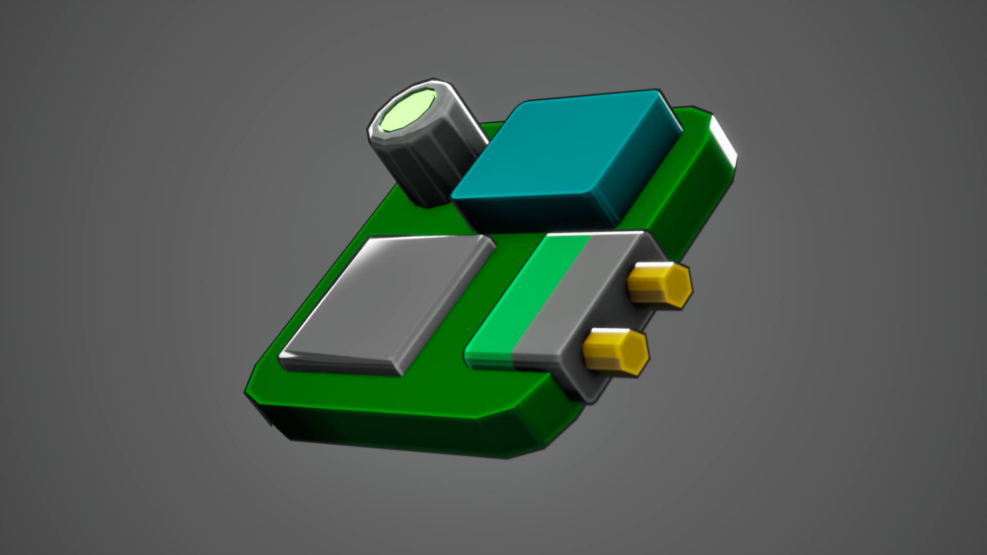
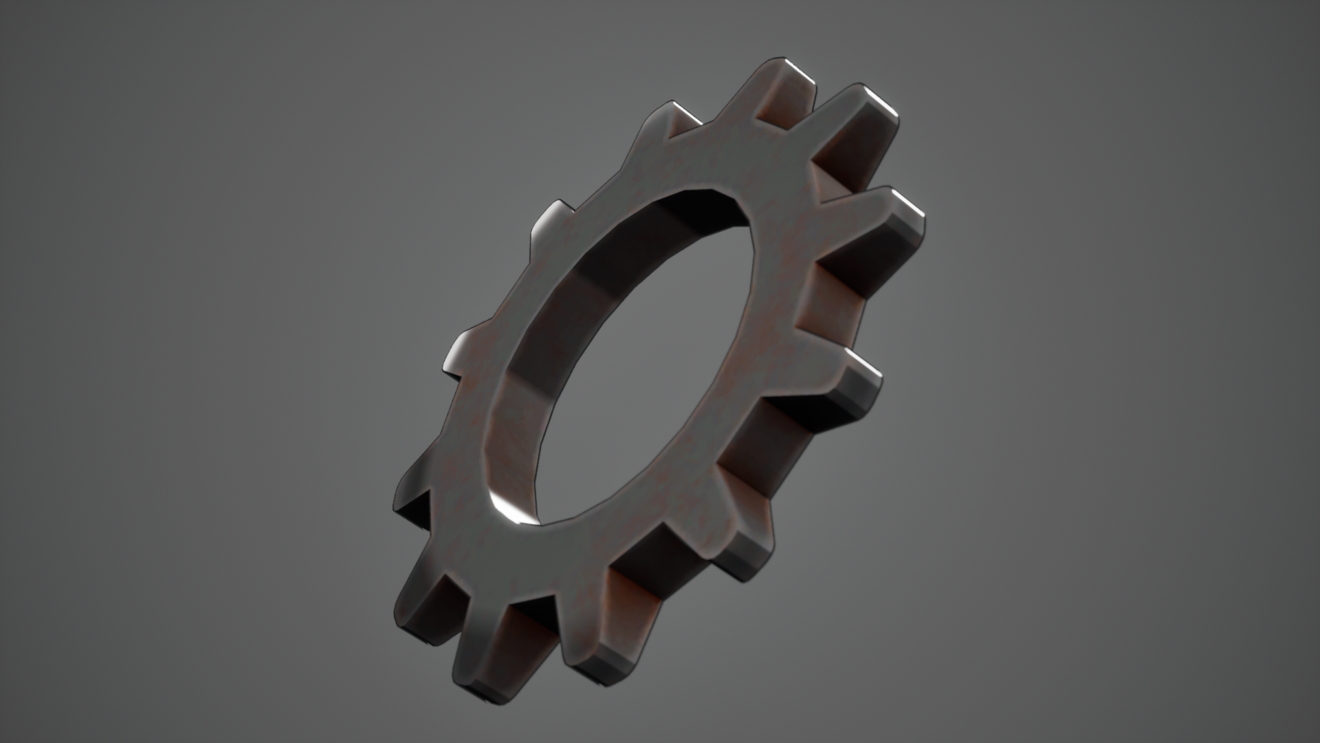
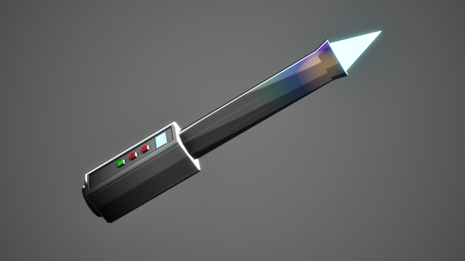
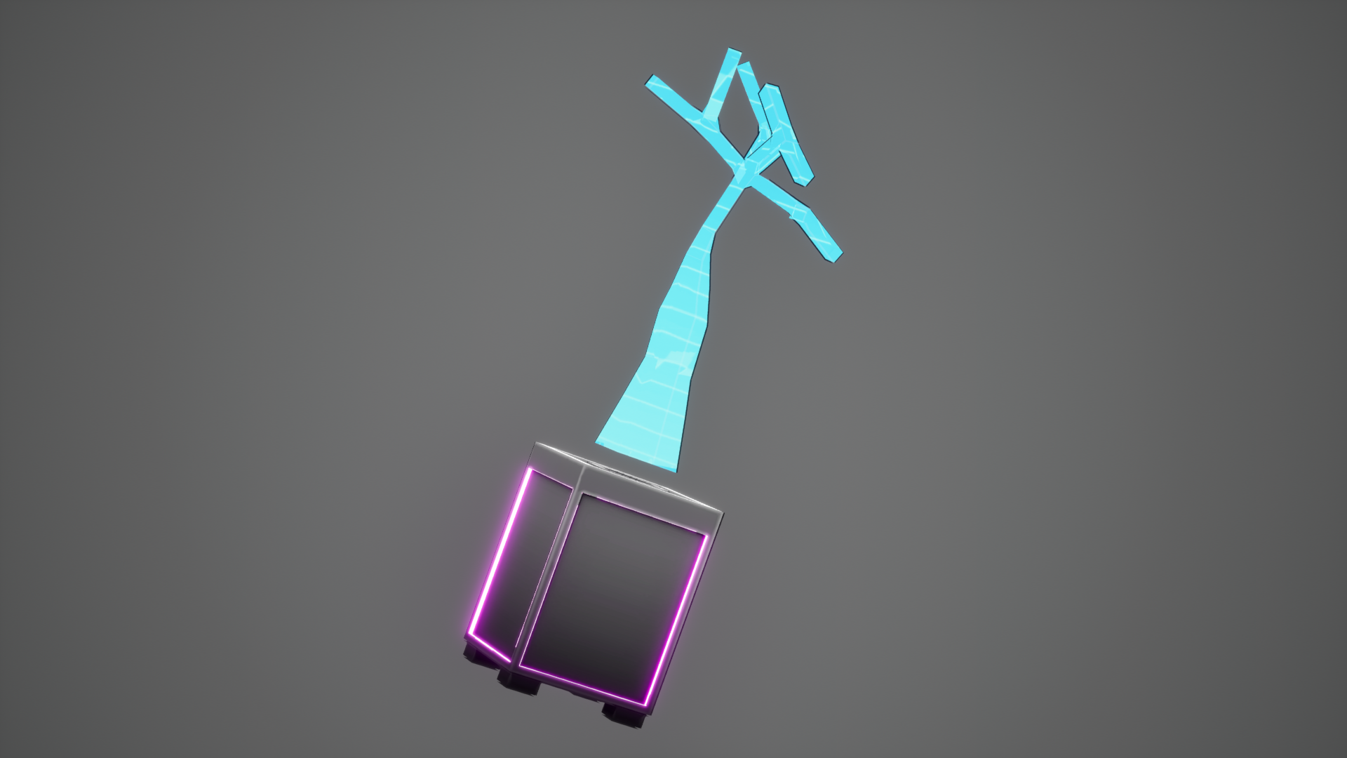
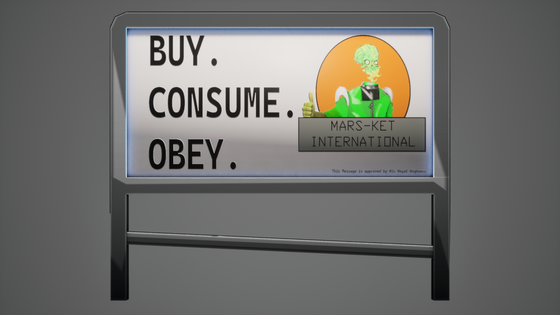
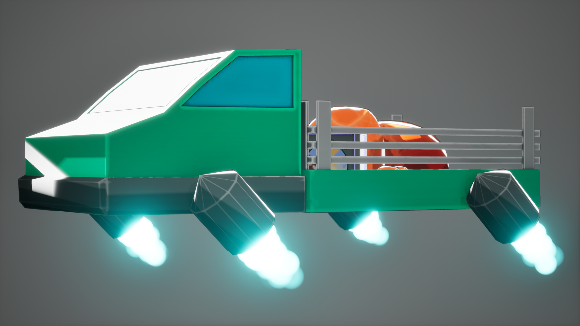
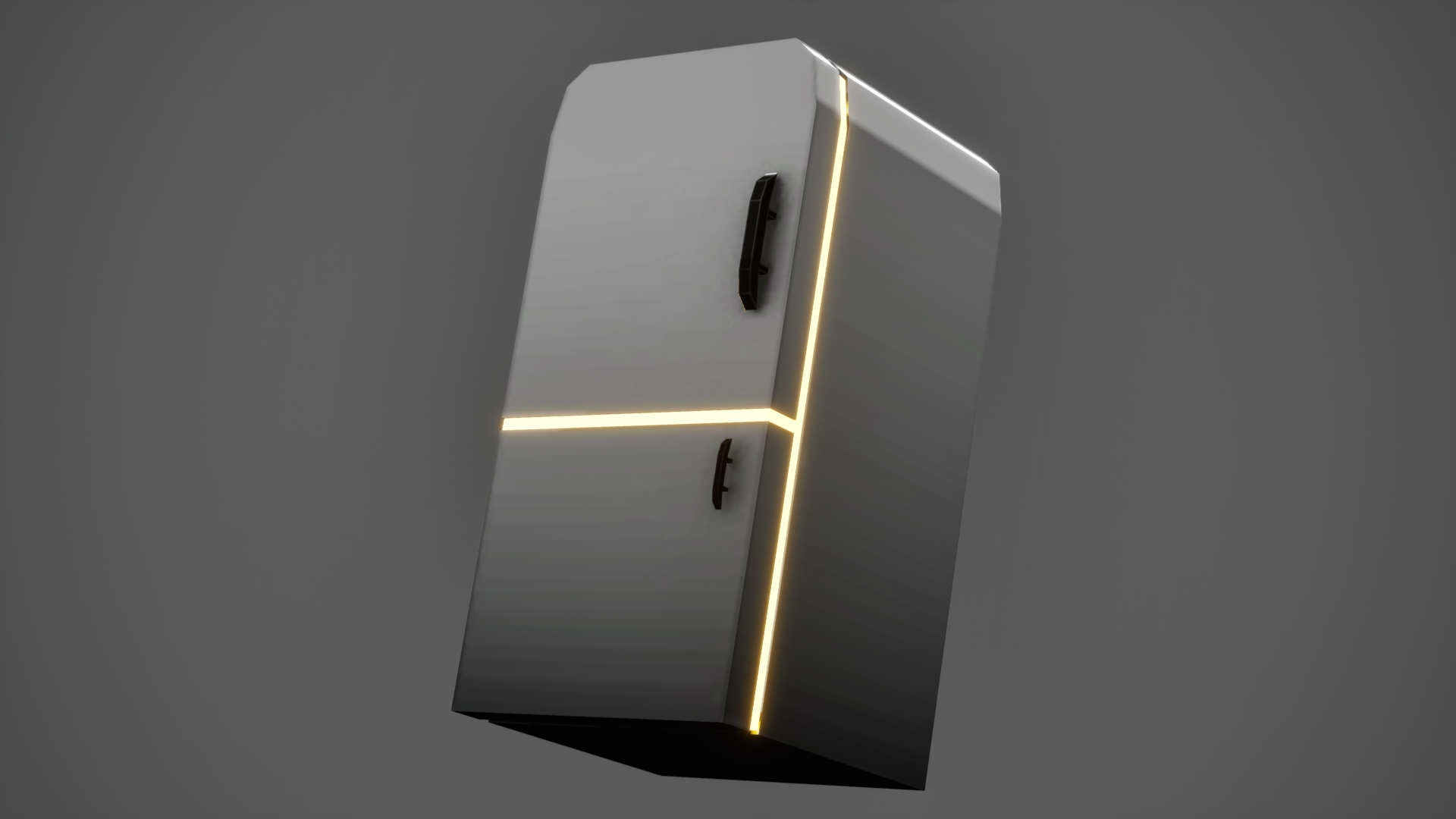
For my 3D assets, I originally started designing them inside of 3ds Max, the software we’d been taught throughout my first year of college. However, our artist was planning on trying out Blender to create the 3D assets he was working on. I like to be familiar with software so I can help out every now and then, whether it’s with an issue or actually creating the asset. I actually found the switch to be really easy, and the experience a lot more efficient to work with.
One of the lessons I learned from Pirate Wizard and Composting Game was the importance of texture resolution. Keeping them at 4K Resolution can be very heavy on the player's hardware, so inside of Tactics, Tea and Tentacles I heavily considered the resolution of textures relative to how large the object was, and how much it appears throughout the game.
Alongside this, when developing the textures for these models, I also created my own Smart Material that would automatically add 4 pre-set layers (Base Colour, Ambient Occlusion, Curvature, and Gradient) and shared this with the rest of my team to allow for consistency with our textures.
The transition from 3ds Max to Blender was a very clear improvement and development of my skills, helping to really enhance the look of the game even further. I think to continue to improve on the new set of skills I've been learning, I should continue to look into Blender's tools to see how I can improve and streamline the development of my 3D assets. An area that can be improved on, for sure, is to check models that I use the bevel tool on so that I don't leave my models with N-Gons and make sure they are either triangles or quads. I also think that I have made the right choices with keeping the textures just below the 1024 * 1024 mark, since they aren't an asset you persistently see throughout the levels.
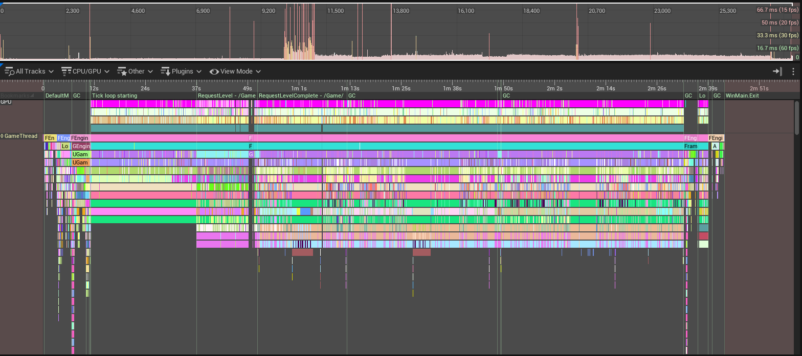
A glaring issue that I discovered during the development process of this game was a huge tank in FPS seconds after you start the game. This was an entirely accidental discovery, found after leaving the game running before having my attention taken away and then returning seconds later. This was a clear issue that had been presented to me, and one that I knew would need tackling, but how to tackle it was something I needed to learn.
Doing some research into optimisation, my first test was optimising by reducing textures and seeing how that would impact performance. I know that I stook to a strict process of having textures at a maximum of 1024*1024, but reducing it down for the assets that don't require large texture sizes, like the iron gear or computer chip. However, I couldn't reliably know if the rest of the team had been following a similar rule as I had, which they hadn't. The easiest way for me to check all my textures was to use a filter of Textures, open them in the mass editor matrix and assign them a new resolution, primarily focusing on those above 1024. Although I modified the textures, this was not the issue.
One way of figuring out the issue with the game was using Unreal Insights, a built-in recording system allowing for the current playthrough to be measured and analysed to help diagnose a problem. I created the trace through the Standalone game option and simply played through the game. The trace broke down the results into a long graph that you could follow and showed all the processes that were occurring throughout the playthrough. It became very apparent what the issue was when checking the individual frame times, which should typically be at 6-7ms, but could sometimes last for 100ms, which doesn't seem like a big amount, but was not good. After discovering that the real culprit behind this was the use of the Event Tick event. Several significant components used the Tick event, such as the Objective Markers and the Objective system, which was heavily impacting the game performance as well as the environment particles. To fix the use of the Event Tick, I essentially created my own version, which would be called 0.2 seconds after the code had been run to create an infinite loop; although not a perfect solution, it ensured that performance was kept at a good level and made the game a lot more stable. This worked really well for the overall gameplay, but there were often frame drops during loading, which was to be expected and is mostly unnoticeable.
Another significant factor in performance was the particles. Niagara Particles have the option to be rendered through the GPU and CPU, which can have some benefits for each. As a default, Niagara is rendered through the CPU, which, for us having atmospheric particles, could hit the frames significantly. I changed the Sim Target to be the GPU rather than the CPU, which was much better for performance, keeping us with a sturdy 140+ fps. Something that I did notice with using the GPU renderer was that you can see particles disappear depending on the angle you view them from, but this issue was resolved by changing the bounds, which let them be viewed all the time.
I never really intended to look into optimising the game to any extent when we started the project, but with the FPS issues we had, it felt imperative to fix the errors and help the game run much smoother. In the future, I hope to be more mindful of the issues that Event Tick can create in the future, and the different ways I can combat it. Likewise, I will also be mindful of the use of a fixed GPU simulation rather than keeping it on the CPU and impacting performance. I think these are useful skills to have developed, whether it be for a future solo project or a group project.
At the start of Gold Standard, I made a bold change to the overall game that would completely change the player experience significantly. In both Alpha and Beta, the player could purchase a Lockpick and Screen for a higher price than picking up the individual components, and also removed the whole need for the player to move around the map, sneaking past Redcoats to find resources, when they could just start with a Key Item and rush through a large portion of the game, which can be seen through the Beta Gameplay more significantly. What made the previous versions worse was that by this point, we had 4/5 methods, and three of those required the use of the Lockpick, which, if the player could simply pick up at the start of the game and purchase an invisibility drink, would make them undetectable and breeze through the game at an insane speed.
So to implement these changes, I removed the buttons of the key items and used Photoshop to shorten the 2D asset to fit the remaining crafting items. I also felt like it would be worthwhile to increase the prices of each item, so the player could buy a majority of the items they would need, but still not the total amount, so they would be forced to explore the map and risk being captured even more. This does increase the time it takes to test out items for ourselves, but for the overall play of the game, it works in our favour.
This was a huge beneficial change to the game; it completely reworks the whole experience and fully forces the player to make the decision of whether they can successfully find an item and not get caught or chased by the Redcoats as a consequence. It works so well at forcing the player to explore and find the items they need, which, when we have a level as large and populated as we do, allows the player to completely skip over the efforts, and the main gameplay aspect of the level makes the game less interesting and something you could easily skip through. As seen in the above videos, there is a clear difference in time between Beta and Gold with these changes.
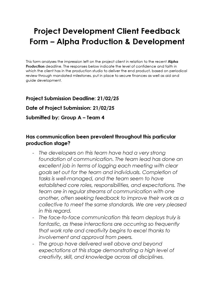
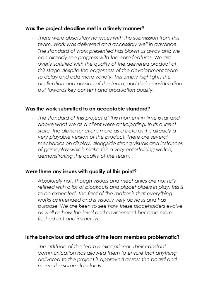
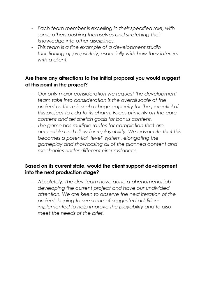
With Alpha coming to a close, we handed in a packaged version of the game alongside the gameplay videos as evidence of what we had achieved. The above document is a review of our performance during the Alpha Phase, documenting what we were doing well and what we could improve on. Continuing on from here, we plan to keep in close contact with the client so that we can receive feedback on what they feel is something we should include in the game, what they aren't a fan of, and how we can further improve on what we've been developing so that we can satisfy the desires of the client.
This feedback from our client is great; it is so reassuring that we are in a positive state and we are really grasping the project with the right mindset and methodology in mind. I am glad that communication has really become a strong suit of our team, being the first collaborative project between the three of us. As mentioned in the feedback, we do have a lot of placeholder assets currently, and we hope to progress through Alpha by improving the visuals and building upon the game as a whole.
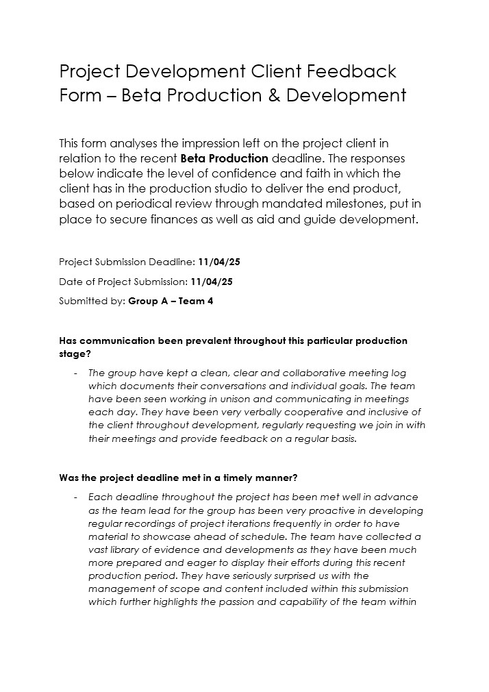
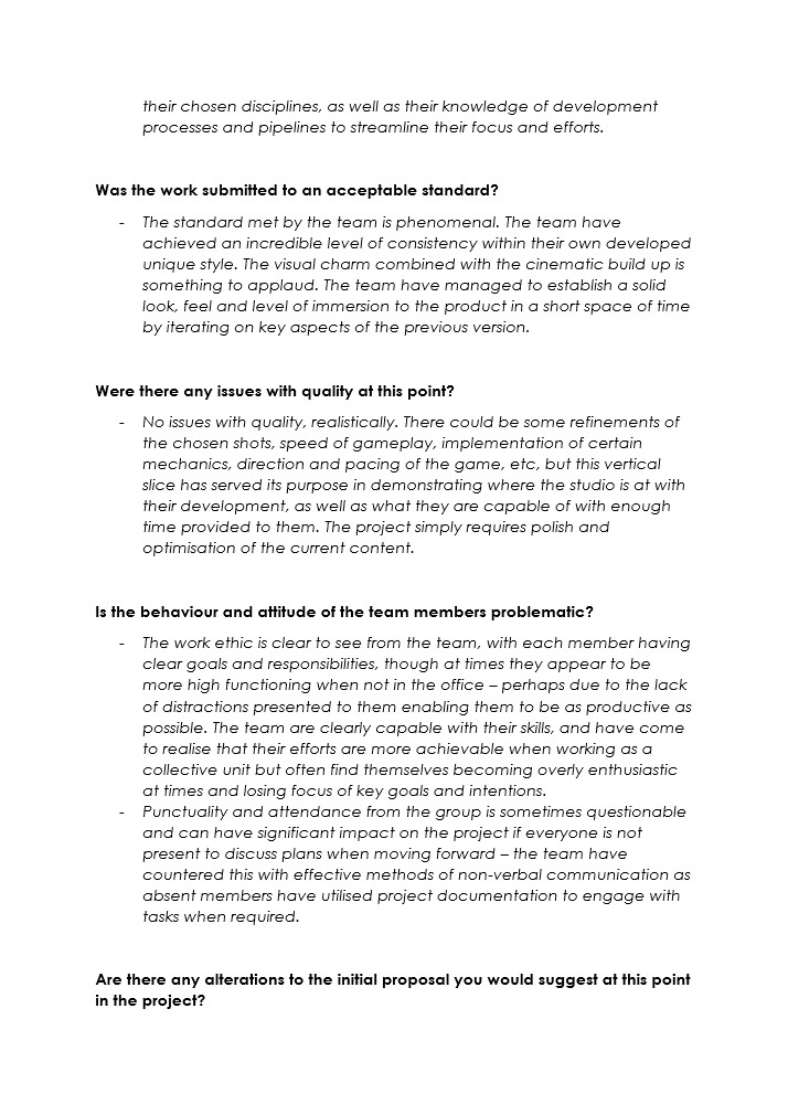
With Beta coming to a close, we once again handed in the gameplay videos and the most recent packaged project for the client to test and give feedback. The above document is an evaluation of several aspects of the project, looking at how we performed as a team, meeting deadlines and the level of quality the project is at. A useful aspect of this document is pointing us in a similar direction we noted from the QA Testing: that the overall direction of guiding the player is lacking, and helping to suggest a couple of ways we could improve on this issue. This continues to show the benefit of communicating with the client, helping us to generate ideas, but also to help with the direction we should move ahead with.
The feedback is once again great, knowing that we are following the correct lines of visually overhauling the game to build this immersive experience, and knowing that we have continued a good standard of communication is also good. As mentioned in the feedback, we should look at ways to help the player navigate the environment even more, giving them a more noticeable tutorial to see the tools and buttons to press throughout the game, as well as looking into how we can have the player follow specific objectives to the method they chose. I think this warrants a look into the marker system we had started and fixing it to work more efficiently, as well as using the same scene capture camera for the inventory map to help with the confusion of navigating the map.
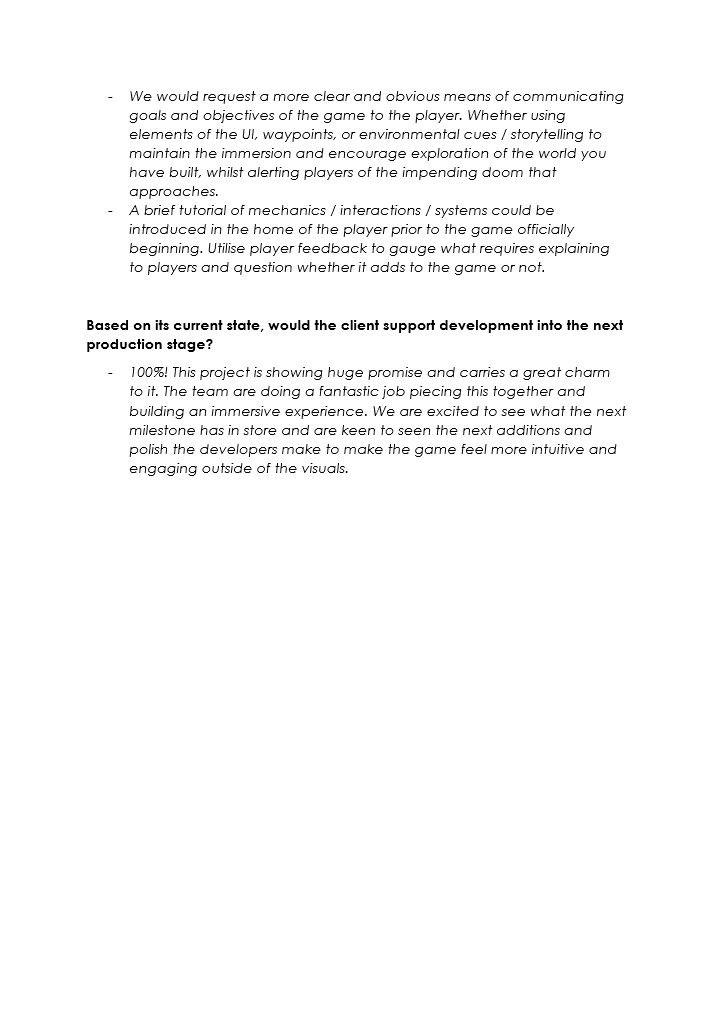
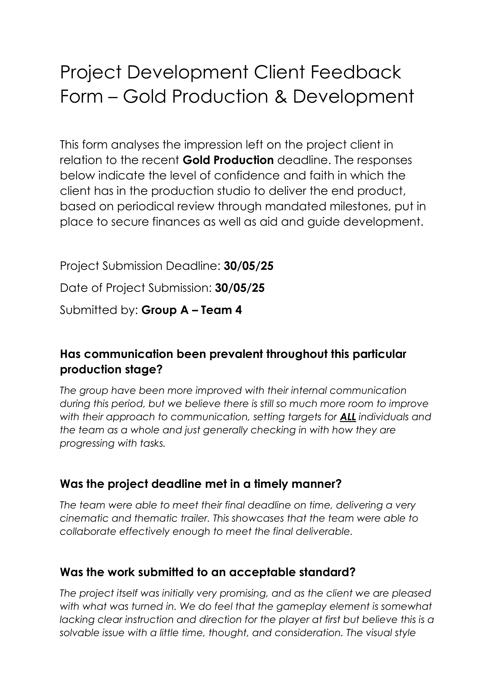
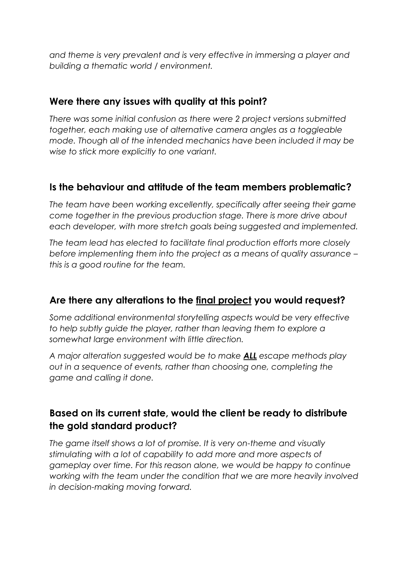
With Gold and the project as a whole coming to an end, we submitted several gameplay videos, documenting the large variety of unique features that each method offers, different mechanics, and the new first-person perspective. Although we didn't include a playable version alongside the videos, we had put the game onto a free publishing platform that the game could be accessed for free. The above document is a glance at some specific elements of the project and the team, looking into communication, how we met deadlines, and how we can improve the game to give a better user experience. This document is a great way of understanding what we are accomplishing well, and what we can further develop to help elevate us further. This continues to show the benefit of communicating with the client, helping us to generate ideas, but also to help with the direction we should move ahead with.
I am personally a bit mixed on this feedback, similarly with the QA Feedback we received, considering that a large chunk of my time was spent ensuring that the Escape Methods were a lot more accessible, and that the markers were fully implemented into the game. I do think the controls could be better presented to the player, rather than above the door, but we've always had a controls menu on the Main Menu and inside of the Inventory, so other than developing a Tutorial level, I don't see any other ways I can enhance the understanding of the mechanics more. I do think it would be an interesting test to see what would work better: allowing the player only one method, or having them follow all of the methods until they escape in the last method. This could very easily be done through some random arrays that select a method only once and permanently set the objectives to follow that method. To make sure this would work well and receive worthwhile feedback, have people test the current version and the updated version to see what they find more enjoyable.
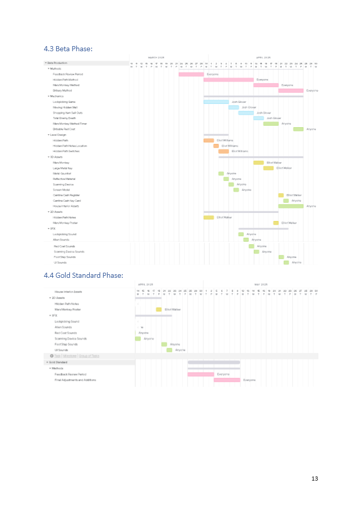
This was one of the hardest parts of this project, developing a video that I could have as the final chapter in such a memorable piece of work. I'm so happy with the quality of everything I have achieved and the skills that I have developed throughout this project. There are so many things I would change to use a better system, such as Data Tables and Gameplay tags, but I'd also lead the project differently as well, probably being a bit stricter on deadlines and prioritising the outlined dates we'd worked on during Pre-Production. There were also so many areas where we also didn't really get to, such as the Mars Monkey Method, something we were really excited to develop, but it was ultimately left out. We even intended to add takedowns into the game, which never really went anywhere, but they don't feel like a necessary part of what we could have added to the game.
I think one of the areas that throughout the pitches and calls that has slowly developed through this period is my confidence, the calls have always been intimidating, even back in first year with all the industry challenges, but as time has gone on, I have become more accepting of these interactions since they're a big part of game studios and the ideas they work on. In time, they became a celebration, in my eyes, of the work we'd accomplished after every milestone, and the feedback was the reward to keep us going. This viewpoint is such a better way of looking at it, especially for when you feel nervous. Even if you'd told me at the start of first year that in a year and a half, I'd be a team lead, helping create such a fun project, I don't think I'd have believed that, because back then I was too scared to take charge of a situation, and I think this project is a brilliant juxtaposition to what I thought I was capable of. Even regarding leading people in a group, I've always seen myself as a contributor rather than pushing people to contribute, so to have actually pushed myself to be a leader and push this group into helping make such a brilliant project, I will forever be proud of myself.
We've been such a wonderful team, and I'm so glad I've been able to share this journey with Elliot and Josh. They've also been such a huge motivation to keep this project going, and their dedication to keep working on the project has been such a positive element of this project. They've made this project feel so much more special and helped me smile through the most gruelling of tasks, especially that Compass Marker System. The two of them are just as essential to this project as I am, helping with making the game stand out so much, and being a huge inspiration to me. I'm also super grateful for the help we received from the first years by providing the spaceships for us to use in the spaceport, which saved us a bunch of time and also added my favourite element to the Main Menu.
As mentioned, this video was one of the hardest pieces to put together, essentially being the final nail in the coffin for the project, as we all look to University and beyond. Knowing that this was my last mark on my time in college, as well as with this amazing team, is such a blessing; there were 101 things we could have done instead, and we could have worked with anyone on this. There was never ever a guarantee that this project or this team would even work, but we made it, and I am so happy to have been a part of that. I've come away with so many lessons and experiences that I will never let go of; I've got a collection of videos and memories around this project that I will reminisce on. As mentioned in the video, this project feels like a prologue to a journey I have dreamed about for a decade, and for this to be that opening is such an honour. I'm so proud of myself, from starting college with very few skills to having such a wide knowledge of different tools and resources that are so readily at my fingertips, because I have always wanted to be able to create something as fun and meaningful as this project, and now I can sit back and smile at something that perfectly fills that.
If there is one thing that I hope this project can do, it is inspire others to not copy what we have done, but to follow a similar journey of growth and development, understand the importance of a team, and complete those dreams they've always had. Because it's so possible. Find the fun inside your projects, make the memories that, in 3 years' time, you will remember and smile at, because that's what makes a project so special.